A Slice Of - Packaging Design
Slice Design

1 Creator

1 Creator


7 Listeners
1 Comment
All episodes
Best episodes
Seasons
Top 10 A Slice Of - Packaging Design Episodes
Goodpods has curated a list of the 10 best A Slice Of - Packaging Design episodes, ranked by the number of listens and likes each episode have garnered from our listeners. If you are listening to A Slice Of - Packaging Design for the first time, there's no better place to start than with one of these standout episodes. If you are a fan of the show, vote for your favorite A Slice Of - Packaging Design episode by adding your comments to the episode page.
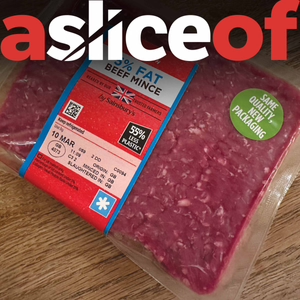
A Slice Of... Sainsbury's Beef Mince Packaging (#2)
A Slice Of - Packaging Design
03/16/23 • 6 min
Branding & packaging design for Sainsbury's mince beef & the issues faced by FMCG brands with appetite appeal.
Creating appetite appeal on food packaging design is incredibly important. If it doesn’t look tasty, then consumers won’t buy it.
So in this podcast, we look at the rather bizarre new packaging design for Sainsbury’s, beef mince.
Thanks to Joe Puttick and the other contributors for their thoughts!
(All opinions are their own)
I plan to keep the podcast to around five minutes each, and I’ll include some voice message comments that have been sent through about the packs from my LinkedIn page.
You can find our contact details below so please feel free to connect:
Alan Gilbody on Linkedin:
https://www.linkedin.com/in/alangilbody/
Slice Design Company website


3 Listeners
A Slice of..... Trailer.
A Slice Of - Packaging Design
03/09/23 • 0 min

2 Listeners
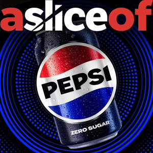
A Slice Of... Pepsi Packaging Design (No. 17)
A Slice Of - Packaging Design
01/23/24 • 19 min
Branding and packaging design for Pepsi and the issues faced by FMCG brands rebranding classics.
At the beginning part of 2023, most of the social media feeds were flooded with a brand new take on packaging design classic.
The last time the brand had had a revamp was back in 2008 and with it pending 125th Anniversary, it was probably high time for a refresh so today I wanted to talk about that icon. Soft drinks that is Pepsi
It’s something that cause much debate across LinkedIn and plenty of debate in my DesignStudio.
Now that we’ve lived with the Design for the last six months or so, it would be great to look at it and reevaluate it in advance of his pending launch, and I thought he better than my old boss from Futurebrand Bill Wallsgrove
Each week, ‘a slice of’, will take a look at a supermarket brand and critique the pack design to find out what works, or doesn’t. What makes you desire them, or even hate them? Importantly what makes us put them in our shopping basket! I plan to keep the podcast to around five minutes each, and I’ll include some voice message comments that have been sent through about the packs from my LinkedIn page. You can find our contact details below: Alan Gilbody on Linkedin: https://www.linkedin.com/in/alangilbody/ Slice Design Company website https://slicedesign.co.uk #packagingdesign #packdesign #packaging #branddesign #branding #pepsi #drinks #carbonates #softdrinks

2 Listeners
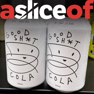
A Slice Of... Good Sh*t Cola Packaging Design (No. 19)
A Slice Of - Packaging Design
01/23/24 • 6 min
Branding and packaging design for Good Sh*t Cola and the issues faced by FMCG brands using humour to sell.
If you make a consumer smile, you have tapped into an important human emotion and engaged them, so this week we are going to be taking a look at a brand that does just that, it’s that cheeky little upstart from the world of soft drinks, Good Sh*t Cola.
I hadn't actually seen the brand before as it has not yet made it over to the UK. In fact, one of my LinkedIn connectons sent it over to me along with the note - You are gong to love this!
It made me smile enough to want to look it up online and in doing so instantly highlighted an issue. Sure its fun but what is it and why do I need it?
Each week, ‘a slice of’, will take a look at a supermarket brand and critique the pack design to find out what works, or doesn’t. What makes you desire them, or even hate them? Importantly what makes us put them in our shopping basket! I plan to keep the podcast to around five minutes each, and I’ll include some voice message comments that have been sent through about the packs from my LinkedIn page. You can find our contact details below: Alan Gilbody on Linkedin: https://www.linkedin.com/in/alangilbody/ Slice Design Company website https://slicedesign.co.uk #packagingdesign #packdesign #packaging #branddesign #branding #cocacola #drinks #coke #softdrinks #fun #humour

2 Listeners

A Slice Of... Pattern Hair Products Packaging (#4)
A Slice Of - Packaging Design
03/26/23 • 4 min
Branding & packaging design for Pattern hair products & the issues faced by FMCG brands with being different.
Always be seen to do something different and never be afraid to be bold with your packaging design!
Many personal care and cosmetic brands follow a very stale and characterless approach to their pack design. The shelves in these sectors are strewn with examples of just type, on a single coloured background, so it’s refreshing to see brands in this area do something a little different.
(All comments are taken from my LinkedIn page and voiced on the podcast by actors) Each week, ‘a slice of’, will take a look at a supermarket brand and critique the pack design to find out what works, or doesn’t. What makes you desire them, or even hate them? Importantly what makes us put them in our shopping basket! I plan to keep the podcast to around five minutes each, and I’ll include some voice message comments that have been sent through about the packs from my LinkedIn page. You can find our contact details below: Alan Gilbody on Linkedin: https://www.linkedin.com/in/alangilbody/ Slice Design Company website https://slicedesign.co.uk


2 Listeners
1 Comment
1
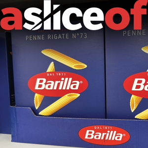
A Slice Of... Barilla Pasta Packaging (#3)
A Slice Of - Packaging Design
03/21/23 • 5 min
Branding and packaging design for Barilla pasta and the issues faced by FMCG brands with tradition & sustainability.
It’s not often that I literally stop and stare in awe at a piece of packaging design. The pasta shelf has traditionally been a much unloved section of the supermarket. Plastic packs with the same old pastiche, Italian look. Then came Barilla!
(All comments are taken from my LinkedIn page and voiced on the podcast by actors) Each week, ‘a slice of’, will take a look at a supermarket brand and critique the pack design to find out what works, or doesn’t. What makes you desire them, or even hate them? Importantly what makes us put them in our shopping basket! I plan to keep the podcast to around five minutes each, and I’ll include some voice message comments that have been sent through about the packs from my LinkedIn page. You can find our contact details below: Alan Gilbody on Linkedin: https://www.linkedin.com/in/alangilbody/ Slice Design Company website https://slicedesign.co.uk

2 Listeners
1 Comment
1
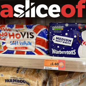
A Slice Of... Festive Packaging Design (No. 21)
A Slice Of - Packaging Design
11/30/23 • 8 min
Branding & packaging design for Festive products & the issues faced by FMCG brands protecting brand logos.
I’m seeing the example on the image quite a lot recently. Brands are challenging and changing their logo in order to fit a seasonal offering.
Hovis has transformed to ‘Ho Ho Hovis’ and Warburtons, rather more subtly has become ‘Warbrrrtons’.
Whilst this may seem fitting, it removes recognition from previously strong branding. Importantly, maintaining brand consistency also strengthens the legal case from private labels and discounters trying to copy hard fought assets and equity.
Now, many people may say, it shows the power of a good logo and how it can be flexed. The truth is, it doesn’t show flexibility, it shows dilution, and that is not what a successful brand should do.
Simply put, you don’t muck about with the logo and that’s exactly what I said on my recent LinkedIn post which is prompted quite a lot debate.
So why is this? why is the brand logo sacrosanct, let’s dive in.
Each week, ‘a slice of’, will take a look at a supermarket brand and critique the pack design to find out what works, or doesn’t. What makes you desire them, or even hate them? Importantly what makes us put them in our shopping basket! I plan to keep the podcast to around five minutes each, and I’ll include some voice message comments that have been sent through about the packs from my LinkedIn page. You can find our contact details below: Alan Gilbody on Linkedin: https://www.linkedin.com/in/alangilbody/ Slice Design Company website https://slicedesign.co.uk #packagingdesign #packdesign #packaging #branddesign #branding #christmas #xmas #baking #bakery #bread


2 Listeners
1 Comment
1
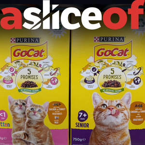
A Slice Of... Purina Go-Cat Packaging Design (No. 12)
A Slice Of - Packaging Design
06/09/23 • 5 min
Branding and packaging design for Purina Go-Cat pet food and the issues faced by FMCG brands with busy packs.
Have you ever wondered why some brands excel at capturing our attention while others seem to get lost in the crowd?
Well, one crucial aspect of successful branding lies in the packaging design, specifically in making sure that the front and back of the pack work harmoniously to convey a clear and impactful message.
Importantly, that both the front and the back each have clear and distinct roles.
So today, we’re going be looking at the petfood aisle and talking about a particular piece of packaging that struggles with this Purina Go-Cat. Each week, ‘a slice of’, will take a look at a supermarket brand and critique the pack design to find out what works, or doesn’t. What makes you desire them, or even hate them? Importantly what makes us put them in our shopping basket! I plan to keep the podcast to around five minutes each, and I’ll include some voice message comments that have been sent through about the packs from my LinkedIn page. You can find our contact details below: Alan Gilbody on Linkedin: https://www.linkedin.com/in/alangilbody/ Slice Design Company website https://slicedesign.co.uk #packagingdesign #packdesign #packaging #branddesign #branding #petfood #pets #pet #cat #food #BOP #backofpack

2 Listeners
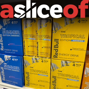
A Slice Of... Red Bull Packaging Design (No. 20)
A Slice Of - Packaging Design
11/17/23 • 5 min
Branding and packaging design for Red Bull and the issues faced by FMCG brands creating masterbrands.
If you have invested time and energy in an instantly recognisable, master brand, it’s advantageous to use this navigational aid across the entire portfolio.
This consistency creates reassurance for your consumer and links the wider portfolio together.
It also ensures that your product looks like it is from the brand leader rather than one of the copycat discounters.
This inconsistency creates sub ranges and product lines that don’t seem as though they are part of the portfolio and so risks them disappearing into the background on the shelf.
A robust masterbrand serves as a beacon to reassure the consumer of their choice. If you have one, use it or risk losing out to the competition.
So, today, we're talking about the power of masterbrands and why consistency is key when it comes to product packaging across a brand's portfolio.
One of the best cases in point here Red Bull, and specifically how they seem to have forgotten that unique checkerboard identifier from the parent pack when extending the range.
Each week, ‘a slice of’, will take a look at a supermarket brand and critique the pack design to find out what works, or doesn’t. What makes you desire them, or even hate them? Importantly what makes us put them in our shopping basket! I plan to keep the podcast to around five minutes each, and I’ll include some voice message comments that have been sent through about the packs from my LinkedIn page. You can find our contact details below: Alan Gilbody on Linkedin: https://www.linkedin.com/in/alangilbody/ Slice Design Company website https://slicedesign.co.uk #packagingdesign #packdesign #packaging #branddesign #branding #energydrinks #drinks #energy #softdrinks #masterbrand

2 Listeners
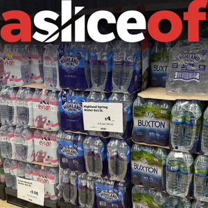
A Slice Of... Bottled Water Packaging Design (No. 8)
A Slice Of - Packaging Design
05/01/23 • 8 min
Branding and packaging design for bottled water brands and the issues faced by FMCG brands being sustainable.
I’ve never really understood the need for bottled water. It’s bulky, it looks ugly in store and we can get it out of a tap, can’t we?
Whilst that may make sense in certain corners of the world, do we really need bottled water in developed countries? Is it actually serving in need or are we being served quite possibly the greatest marketing ploy of all time?
Clearly there are certain situations where locally sourced water may not be clean, but we are lucky that in most instances tap water is easy to obtain and completely safe.
So why do we have all of these brands, taking up all of this valuable retail space, requiring logistics that cost much more than infrastructure that is already in place, to transport it from one place to another?
So this week we will be looking at the bottled water fixture.
Each week, ‘a slice of’, will take a look at a supermarket brand and critique the pack design to find out what works, or doesn’t. What makes you desire them, or even hate them? Importantly what makes us put them in our shopping basket! I plan to keep the podcast to around five minutes each, and I’ll include some voice message comments that have been sent through about the packs from my LinkedIn page. You can find our contact details below: Alan Gilbody on Linkedin: https://www.linkedin.com/in/alangilbody/ Slice Design Company website https://slicedesign.co.uk

2 Listeners
Show more best episodes

Show more best episodes
Featured in these lists
FAQ
How many episodes does A Slice Of - Packaging Design have?
A Slice Of - Packaging Design currently has 33 episodes available.
What topics does A Slice Of - Packaging Design cover?
The podcast is about Marketing, Podcasts and Business.
What is the most popular episode on A Slice Of - Packaging Design?
The episode title 'A Slice Of... Sainsbury's Beef Mince Packaging (#2)' is the most popular.
What is the average episode length on A Slice Of - Packaging Design?
The average episode length on A Slice Of - Packaging Design is 7 minutes.
How often are episodes of A Slice Of - Packaging Design released?
Episodes of A Slice Of - Packaging Design are typically released every 10 days, 20 hours.
When was the first episode of A Slice Of - Packaging Design?
The first episode of A Slice Of - Packaging Design was released on Mar 9, 2023.
Show more FAQ

Show more FAQ
Comments

@Slicedesign
Apr 12
1 Like
Reply