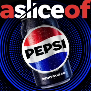
Branding and packaging design for Pepsi and the issues faced by FMCG brands rebranding classics.
At the beginning part of 2023, most of the social media feeds were flooded with a brand new take on packaging design classic.
The last time the brand had had a revamp was back in 2008 and with it pending 125th Anniversary, it was probably high time for a refresh so today I wanted to talk about that icon. Soft drinks that is Pepsi
It’s something that cause much debate across LinkedIn and plenty of debate in my DesignStudio.
Now that we’ve lived with the Design for the last six months or so, it would be great to look at it and reevaluate it in advance of his pending launch, and I thought he better than my old boss from Futurebrand Bill Wallsgrove
Each week, ‘a slice of’, will take a look at a supermarket brand and critique the pack design to find out what works, or doesn’t. What makes you desire them, or even hate them? Importantly what makes us put them in our shopping basket! I plan to keep the podcast to around five minutes each, and I’ll include some voice message comments that have been sent through about the packs from my LinkedIn page. You can find our contact details below: Alan Gilbody on Linkedin: https://www.linkedin.com/in/alangilbody/ Slice Design Company website https://slicedesign.co.uk #packagingdesign #packdesign #packaging #branddesign #branding #pepsi #drinks #carbonates #softdrinks
01/23/24 • 19 min

2 Listeners
Featured in these lists
Generate a badge
Get a badge for your website that links back to this episode
<a href="https://goodpods.com/podcasts/a-slice-of-packaging-design-251622/a-slice-of-pepsi-packaging-design-no-17-33278107"> <img src="https://storage.googleapis.com/goodpods-images-bucket/badges/generic-badge-1.svg" alt="listen to a slice of... pepsi packaging design (no. 17) on goodpods" style="width: 225px" /> </a>
Copy
