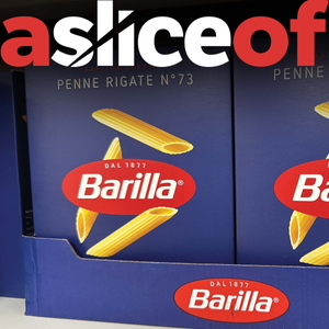
A Slice Of... Barilla Pasta Packaging (#3)
03/21/23 • 5 min
2 Listeners
Branding and packaging design for Barilla pasta and the issues faced by FMCG brands with tradition & sustainability.
It’s not often that I literally stop and stare in awe at a piece of packaging design. The pasta shelf has traditionally been a much unloved section of the supermarket. Plastic packs with the same old pastiche, Italian look. Then came Barilla!
(All comments are taken from my LinkedIn page and voiced on the podcast by actors) Each week, ‘a slice of’, will take a look at a supermarket brand and critique the pack design to find out what works, or doesn’t. What makes you desire them, or even hate them? Importantly what makes us put them in our shopping basket! I plan to keep the podcast to around five minutes each, and I’ll include some voice message comments that have been sent through about the packs from my LinkedIn page. You can find our contact details below: Alan Gilbody on Linkedin: https://www.linkedin.com/in/alangilbody/ Slice Design Company website https://slicedesign.co.uk
Previous Episode

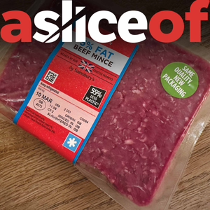
A Slice Of... Sainsbury's Beef Mince Packaging (#2)
Branding & packaging design for Sainsbury's mince beef & the issues faced by FMCG brands with appetite appeal.
Creating appetite appeal on food packaging design is incredibly important. If it doesn’t look tasty, then consumers won’t buy it.
So in this podcast, we look at the rather bizarre new packaging design for Sainsbury’s, beef mince.
Thanks to Joe Puttick and the other contributors for their thoughts!
(All opinions are their own)
I plan to keep the podcast to around five minutes each, and I’ll include some voice message comments that have been sent through about the packs from my LinkedIn page.
You can find our contact details below so please feel free to connect:
Alan Gilbody on Linkedin:
https://www.linkedin.com/in/alangilbody/
Slice Design Company website
Next Episode

A Slice Of... Pattern Hair Products Packaging (#4)
Branding & packaging design for Pattern hair products & the issues faced by FMCG brands with being different.
Always be seen to do something different and never be afraid to be bold with your packaging design!
Many personal care and cosmetic brands follow a very stale and characterless approach to their pack design. The shelves in these sectors are strewn with examples of just type, on a single coloured background, so it’s refreshing to see brands in this area do something a little different.
(All comments are taken from my LinkedIn page and voiced on the podcast by actors) Each week, ‘a slice of’, will take a look at a supermarket brand and critique the pack design to find out what works, or doesn’t. What makes you desire them, or even hate them? Importantly what makes us put them in our shopping basket! I plan to keep the podcast to around five minutes each, and I’ll include some voice message comments that have been sent through about the packs from my LinkedIn page. You can find our contact details below: Alan Gilbody on Linkedin: https://www.linkedin.com/in/alangilbody/ Slice Design Company website https://slicedesign.co.uk
If you like this episode you’ll love
Episode Comments
Featured in these lists
Generate a badge
Get a badge for your website that links back to this episode
<a href="https://goodpods.com/podcasts/a-slice-of-packaging-design-251622/a-slice-of-barilla-pasta-packaging-3-29099376"> <img src="https://storage.googleapis.com/goodpods-images-bucket/badges/generic-badge-1.svg" alt="listen to a slice of... barilla pasta packaging (#3) on goodpods" style="width: 225px" /> </a>
Copy


