
urhere
Gretchen Peterson, Vanessa Knoppke-Wetzel
All episodes
Best episodes
Seasons
Top 10 urhere Episodes
Goodpods has curated a list of the 10 best urhere episodes, ranked by the number of listens and likes each episode have garnered from our listeners. If you are listening to urhere for the first time, there's no better place to start than with one of these standout episodes. If you are a fan of the show, vote for your favorite urhere episode by adding your comments to the episode page.
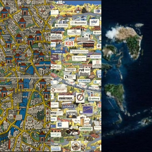
Three Advertising Maps
urhere
05/19/21 • 44 min
Links
Wonderground Map of London [2:47]
Silicon Valley 1991 [15:35]
TAM Cargo Series [31:38]
Wonderground Map of London
Here we have a cartoon map with a black and white chevron pattern that forms the map border. You might think a heavy black and white chevron pattern would overwhelm a map but this doesn’t because there is otherwise so much information throughout the composition that it doesn’t out-compete. This is an example of maximalism, which is definitely not how Vanessa decorates her home.
What is it advertising though? London’s Underground metro system! You’re essentially getting an advertisement of London itself, showing you what you could do in London, and the Underground is how you would get to all those interesting places. In 1914, when this was made, people weren’t really using the Underground on the weekends, it had a reputation for being crowded and dirty, and this map was supposed to--get ready for it--elevate the Underground. Underground stations are named inside blue ribbons. This isn’t a tourist map, it’s for people who already live there as exemplified by the text bubbles highlighting inside jokes that you might not understand if you weren’t a resident. Is there really a dragon in the middle of London? We wonder.
The map artist is MacDonald Gill. We both made a special point of noticing that this map is almost like Where’s Waldo but better! It’s better because you are exploring it in a way that makes you keep looking for more fun things even after you’ve found one or two, and also because it makes you interested in visiting these places in person. The color scheme is yellow and blue with a little red, the black outlining along the Thames River is quite bold but that’s okay because it fits in with the rest of the colorful boldness. What is not on top of the visual hierarchy is the white roofed buildings, instead they form a pattern, but they don’t stand out a lot. In this way the roofs create visual texture and are functional without being overbearing. There is more detail on the salient landmarks though, so those can standout a little more if you look closely.
We philosophize over the fact that time is nothing. Back to the map, we point out some of the inside jokes that we don’t understand. There should be one of these with inside jokes for today for every location. Vanessa wants to go to London now, even in 2021, so the advertising worked!
Silicon Valley 1991
Here’s another pictorial map. This one might not make us want to visit there but it does definitely feel advertise-y. The map is cool and pretty with a lot of textures that make it a bit painterly, with visible brush strokes and pen strokes. The map presents a perspective as though you are in the depths of the valley. The vanishing point is directly in front of the figures at the bottom, but the perspective and pitch of the map changes such that you feel that the roads are dipping and undulating, giving the distinct impression of hills that are going upward toward the top of the map. The large hot air balloon and plane are at the top and provide depth and perspective.
We wonder if the map maker, Jill Amen, created the map first and then placed the ads on top, and if so, we’d like to see it without all the ads. Each of the organizations shown on the map paid to get their adverts on it. This kind of advertising happens today in our digital maps as well, where a company pays to be on the map with a unique icon or label. The billboard-like advertisements are blocking our view of the basemap! We are glad that the nice San Francisco landmarks are not covered up at the top. By the way, maps like this are still being made today, search for Silicon Valley Map to find more from the same company.
A map called Silicon Valley in 1982 has a similar perspective and is also a pictorial so we wonder how it relates to this and if it was an inspiration for it. There was definitely social commentary associated with the Silicon Valley in 1982 map so we wonder whether this one might have an element of that as well. There are a lot of nods to the technology and science industries, more landmarks, a budget sign tied to a rock near the bay, and maybe a reference to Berkeley being off in the distance, though we aren’t completely sure. Diversity in the technology industry, or rather, its lack of it, is brought up here. Are companies today taking diversity seriously? Were they then?
TAM Cargo Series
“Anything to Anywhere” is the...
Three Video Game Maps
urhere
05/05/21 • 44 min
Links
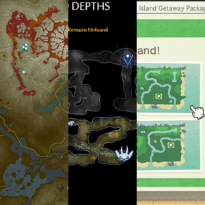
Zelda, Breath of the Wild [2:08]
Ori and the Will of the Wisps [15:53]
Animal Crossing [28:22]
Zelda, Breath of the Wild
One of the first things you notice about this game map is that it has a lot of green hues and resembles camouflage, giving you the immediate sense that this will be a nature-based type of game. Multitudinous contour lines further this outdoorsy feeling but also provide much needed assistance to the gamer, since in this game you need them, just as you would in real life, to determine how easy or how difficult navigation will be in certain areas. An action-adventure game that was released in 2017, this game is still really popular today. It’s an open-world type of game, which means you discover things as you go and at your own pace, making the map an important piece of the gaming experience. Critics called this a “landmark open world design,” which is literally based off the map. The character you play, Link, doesn’t know who he is. He needs to learn who he is as he explores and also, by the way, has to try and save the world as well.
Interesting features on the game map include a labyrinth and volcano, both easily understood from the symbology and coloration. Dark green is used for the land at sea level and a lighter green is used for the tops of the hills and mountainous regions. This kind of gradual color scheme that corresponds to the elevation contours is called hypsometric tinting: a technique whereby you aid the map reader’s understanding of the isolines (in this case the isolines are specifically contour lines) by tinting within the bands or groups of bands with a graduated color scheme. This visual reinforcement helps when you are zoomed out and, given the level of detail on the map, it helps a lot with context. You see this with the water coloration as well, which is called bathymetric tinting. In the major digital basemaps of today you’ll see that bridges usually have some sort of special treatment, whether it is a darker casing or a darker line color, and that is just what we’re seeing here: a very dark green on the bridges whereas the main road is in a lighter green. They are also shown with posts and other structural features that help you understand what they are.
Building outlines and other built structures are also shown when you zoom quite a bit in, giving the player clues as to where towns or cities are for talking with other characters and making purchases. By contrast, forested areas are fluffy puffs of polygons denoting overlapping tree canopies. These are essentially merged polygons and were probably intentional in that the generalization probably helps to keep performance optimal by lessening the amount of data and thereby load time.
Ori and the Will of the Wisps
This is a platform adventure game, not an open-world game, and was very well received, especially for its visual quality. It emphasizes exploration. There are cartographer characters in this game! As a player, you get maps from these cartographers, which, while you can explore the game without a map, help you to have a reference point for where you’ve been. Players also don’t know certain places exist without the maps and, as in real life, they help you see what areas could be dangerous. Looking at the tunnels closely you see they are very detailed and have a certain vibrancy. The color of each tunnel in general aligns with the played-world, it corresponds with the color hues.
The whole aesthetic of the glowy, white, wispy character and the vibrancy of the colors against a dark background reminds us of Firefly Mapping, where you take a point based dataset and create glowy dots that appear on top of a dark, maybe black, background. These subtle design choices with the soft glows are really special as the glowing serves to highlight things like when a symbol is selected. We also see a line that shows you where Ori moved and jumped, basically a path that shows where you just were. This is a useful animation technique for mapping to show where things have been. Remember the Harry Potter map with the footprints that we discussed in Three Pop Culture Maps? This is a similar concept. You can see this type of animation in today’s journalism maps, such as animations of flight paths that trail and slowly dissipate.
Animal Crossing
These are some very square islands! The maps for this non-story-based game are very simple and cartoonish, both aesthetics mirroring the simplicity and cartoon nature of a game where you interact with other cute villagers, make some trades, and socialize. This game really took off during the pandemic as it gave people a ...
Three Food Maps
urhere
05/12/21 • 51 min
Links
This Porcineograph [1:45]
Farmers Markets: Accessible to All? From Food: An Atlas [22:40]
Les Grands Vins de Bourgogne [35:20]
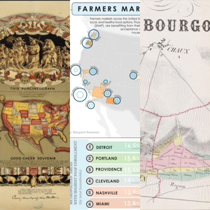
This Porcineograph
This is a weird one. As a fan of weird art, Vanessa’s first impression was that this map is pretty cool, weird, and creepy, and that it would go well in an Orwelian universe. This map is the United States, but as a pig. Yes, that’s right. The word “gehography,” possibly the best geographic pun ever, is used in the sub-title text and gives a sense of the humor that went into it. Aesthetically, we’re looking at a lithograph and this is shown by the level of detail and the way that different textures and colors stop in clear and straight lines. It was commissioned by an eccentric entrepreneur who had built a successful sewing machine company and then poured his money into a pig farm, the opening of which was being announced by way of this map poster. This map was made to announce the opening of his pig farm. This guy had a cause, which was to eradicate foodborne illnesses to make the food market of the 19th century safer with good animal husbandry. To kick things off he made 2,500 copies of this map for a party. It was a “good cheer souvenir,” as it calls itself.
This is a relatively accurate depiction of the United States except where it isn’t. For example, Florida is the front right leg of the pig, which seems to fit pretty well but the tail isn’t part of the country. What should we call maps that look like animals, of which this is just one of many others that could be placed in this genre? On twitter, Robert St. John suggested that they should be called mapaphores, which seems quite fitting.
Other highlights on this map include a hog pouring itself a drink, a reference to brain sauce, a dodo look-alike bird, and a pig eating shrimp. Forming the frame of the map is a ribbon for each state, a pig, and a reference to the state’s favorite pork dish. Colorado’s is something called roast chines, a kind of stuffed bacon apparently and an old dish imported from England. But returning to the main map, you see the utilization of Canada as a supporting feature that creates parts of the hog shape, such as parts of Canada represented as tufts of hair, but there are also parts of Canada that are intentionally maintained in their true geographic shape. The same goes for Mexico.
The state colors have a different color in each such that, for the most part, each state has a color that makes it look visually separated from its nearest neighbors. The Four Color Theorem, which states that a planar map of polygons only needs four colors such that no adjacent polygon has the same color, is an obvious cartographic factoid to bring up in relation to this. Upon closer scrutiny, however, we notice that the map maker has cleverly altered the color scheme to suit the purpose where color was needed to convey the idea of the country as a pig, such as Wisconsin and Michigan both being shades of red where they are supposed to form part of the pig’s ear. A discussion of mitten-shaped states ensues.
Farmers Markets: Accessible to All?
A free book called Food: An Atlas was put together by an organization called Guerrilla Cartography. This map, by Margaret Raimann, is one of the maps in the book. It’s on an important food topic in that it shows farmers’ market accessibility for those who are on the Supplemental Nutrition Assistance Program (SNAP), essentially showing us the proportion of farmer’s markets that accept SNAP in each metropolitan area of the U.S. It shows that there is a large disparity across the country. The circles that are used to show this were really effective in terms of instantaneous understanding of the data even for people who have never seen this kind of data presentation. The labels that curve along the circles of the metro areas are super unique, meaningful, and helpful. The curvy feel on the labels carries over throughout the map and the marginalia and lends to a cohesive look.
The grayscale basemap is notable for its ability to be pulled backward in the visual hierarchy. Pushing yourself cartographically by making grayscale maps is a good exercise. Daniel Huffman, in fact, hosted a monochrome mapping competition a couple of years ago, and its winners are good to look at for inspiration. Speaking of circles though, a lot of cartographic software makes it easy to create proportional circle symbols out of your data to show that there’s more here and less there but we caution that circle size can be difficult for the human eye to differentiate (Meihoefer, The Utility of the Circle as an Effective Cartographic Symbol, 1969). Howev...
04/28/21 • 47 min
Links
Map of the Rivers Huallaga, Ucayali & Amazon [1:53]
View of the Panamint Range Mountains, mines, mills and town site [14:30]
The Melting of Antarctica [31:20]
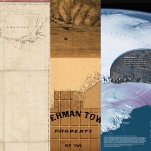
Map of the Rivers Huallaga, Ucayali & Amazon
This is a very wide map due to the shape and length of the river system, leaving the rest of this composition sparsely designed, excluding the graticule, and therefore quite unique. Hernon William Lewis, the main cartographer for this map published in 1851, was in the U.S. Navy and was an explorer, exploring “uncharted territory” of the Amazon. We note that the phrase “uncharted territory” is very specific to where the cartographer is from and here what it means is that it was yet to be explored by the United States.
The mountains here are another example of caterpillar mountain relief styling, a term brought up in a previous episode, and which we now assume is part of the permanent lexicon of the cartographic elite. We also see a nice technique whereby dotted lines allude to the continuance of the tributaries onward upstream even though their entireties are not drawn. Some figure-ground issues could affect the reader as there aren’t a lot of visual cues such as water ripples, trees, or other symbols to cue the land versus the water, though there is a thickness to the upper-bank of the river that helps.
In the literal big-picture, this is a river line that travels from one side of South America to the other, starting from the Amazon Basin in the east and going to Lima, Peru in the west. It’s akin to a map with a single road where all the places along it help you travel on that road but not deviate from it, such as the Itinerary from London to Beauvais, discussed in the Three Tourist Maps episode. Note that to accommodate the span of this river system, the overall map is made from 30 different pieces of paper that are mounted on a cloth.
View of the Panamint Range Mountains, mines, mills and town site
This is a very unique informational/poster layout because we see the mountain range from a front-view and then we also see a top-down map view of the area at the bottom (though this characterization is debated at the end of this section). Panamint was a short-lived town and is now a bonafide ghost town. In fact, it was a town for only a couple of years before the whole place flooded.
The texture for the salt marsh patterning is really amazing and ties in with work that cartographers do today since modern vector maps often employ repeating patterns for various landcover types. There is realism shown in the mountains as well as that salt marsh.
This map is from 1875 and may be a lithograph, but hark! there’s the caterpillar hashing again! There’s a level of depth, color and texture variance that is smoother than in copper plate and woodblock prints as can easily be seen in the various sharp line-stops and the detailed smoke/steam emanating from the train. Just as today when we see differences in cartography due to what we can do with newer software, the “software” of that day had changed to lithography, and we see the changes reflected in these stylistic abilities that they were able to achieve here. Lithography generally employed the use of hydrophobic dyes applied to limestone to achieve this greater mastery of the straight-edged line among other advancements.
Panamint, California, was a silver and copper mining town, with the mines indicated with numbers on the top half of the map. As the story goes, silver was discovered by three bandits who were hiding in a cave here and subsequently laid claim to it. Senators Stewart and Jones bought the claim from them and further developed the mines, though it did not yield as much riches as some of the more famous mines of this era. A couple of years later? The town of about 2,000 was washed out in a flood. Does anyone else feel as we do that this story should be turned into a movie?
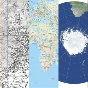
The Melting of Antarctica
This beautiful, contemporary, infographic-type map from National Geographic is primarily blue and white. Cynthia Brewer, in one of her cartography books, says that people really respond positively to blue (while not liking yellow too much) and this blue is indeed what lends beauty to this map. The ice shelves in their purplish color a...
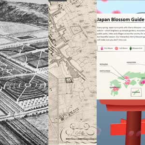
Three Garden Maps
urhere
04/21/21 • 54 min
Links:
Garden maps twitter discussion [0:20]
Chatsworth House 1699 [2:17]
Bourge Castle and Gardens 1697 [17:35]
Japan Cherry Blossom Guide [35:25]
Molly O’Halloran’s garden map [53:14]
Chatsworth House 1699
Here we have another black and white map that manages to be highly detailed despite its lack of color! The map presents a garden at its earliest stages, consisting of 105 acres, and has since been cultivated for 500 years. It’s constantly changing and belongs to the Dukes of Devonshire. Kip and Knyff, the map makers, were well known engravers of English Country house designs and this copperplate engraving really shows off the finer line textures and softer features in certain areas like the background that are possible with copperplates rather than the earlier woodblock technology. Imagine having someone engrave a depiction of your home and garden!
We don’t usually work with maps at this scale so it is refreshing to us to see individual trees. We note the garden is in the Dutch Baroque style. Garden maps tend to have a nice symmetry to them, partly if they are in a certain style of garden, but also because the features are made from the map instead of the other way around. With garden maps, you usually design the map first, and then plant the garden. But with other maps, like for example, the cities of North America or the arboreal forests of the world, you are mapping features that are already there and don’t necessarily have any order or symmetry to them. While cartographers strive for artistic balance this is a limitation we must work within. An analogy between garage sales and posh retail stores happens.
We mention a link to the satellite view of this same area so you can see how it looks today. Here is that link.
There’s tons of texture on this map which is part of what makes it so lovely. In the early 2000s we didn’t have a lot of texture on maps, which was a limitation of old geo software, but now we can definitely add texture to maps so this old map provides good inspiration. It’s noted that the deer park, we are sure, would have been for watching the deer, not hunting them. Ahem. The oblique view is off-center and not centered on the castle structure; the dark and dense maze-like feature pulls your eye toward the right, which is a shift of focus that we’re not used to and helps you sweep across and analyze the whole map. This truly was a map of the gardens, not of the castle. The line pattern in the water, with darkening at the curves, is intentional and is something we do in today’s maps to provide depth, artistry and realism.
Bourge Castle and Gardens 1697
This beautiful copperplate engraving with an oblique shift is similar to the Chatsworth map in terms of the use of patterns but is a different aesthetic in that it is a lot brighter, with fewer heavy textures. The roads are cut out from the texture in a clean way that is appealing to the eye. This is a way to do texture without it feeling too heavy. Texture can be hard to do because if you have features that are large or imbalanced then it is jarring or even dizzying. Hatching, or diagonal lines, are kept to smaller area features here, which is the way to do hatching well. Patterns and textures can so quickly overpower a map and make it feel visually stressful. But here the lines are really thin, and when you’re looking at the entire piece, the lines condense, creating a feel of a single color fill. In this light, we check out the patterns of the fields, fences, and even the cemetery to figure out what’s going on in them.
This is a map that people today would be tempted to make a legend for, since there are so many different patterns, each ostensibly representing an individual type of feature. With today’s software making it so easy for cartographers to automatically add legends, it ends up being an automatic thing. But if we think about what truly matters to the reader for their understanding of a map, if it is something that the reader really needs to interpret then sure, put it in a legend, but otherwise leave it out. Indeed we do see a growing movement, especially in news publications, to exclude legends more and more and instead to just label the items on the map directly. This technique minimizes eye movement (i.e., no legend-map-legend scanning) for the reade...
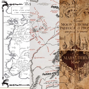
Three Pop Culture Maps
urhere
04/07/21 • 52 min
List of Maps
A Game of Thrones [2:35]
The Lord of the Rings [23:29]
Harry Potter, The Marauder’s Map [34:55]
A Game of Thrones
The two black and white maps from the first A Game of Thrones book have the feel you want from a book like this--old. Monochrome maps without much shading like these, especially older ones, or ones that have that historic look, often have an ambiguity about them that can be unsettling. Which part of the map is the land and which part is the water? In Gestalt psychology there are several principles of perception, one of which is figure-ground. When you look at a picture, can you identify the figure from the ground? There are three possibilities: stable, reversible, or ambiguous. In this case, the map could be described as having some ambiguity with regard to figure-ground in that depending on how you look at it, the land could be water or vice-versa. In cartography, it can be important to get the figure-ground differentiation correct. However, that does not necessarily make these particular maps incorrect since they are purposefully emulating old black and white book map styles, and those imposed some stylistic limitations, including a dearth of shading, perhaps to save on printer ink.
The mountains, textures, neatline flourishes, and water elements all have a historical feel. The legend is a bit of an exception because of the more modern looking typeface and the perfectly rectangular neatline around it. Fantasy maps like these can be difficult to make in terms of the geographic features because you don’t want them to look too perfect, and therefore unrealistic, so starting from an existing geography or using realistic algorithms for coastlines and rivers might be helpful.
A foray into other A Game of Thrones maps ensues. The map that forms the intro to the TV show is very interesting in that it becomes more extensive as the show progresses from season to season, providing a sense of connection and understanding that you re-visit at the intro to each episode. Subtle animated wave textures show how well thought out this TV show intro map is, cartographically speaking, and with a grid that helps you understand the scale and get a sense of how the direction is changing as the perspective changes. The labels also move with the wave movement, letter by letter. In short, this is an intro map you do not want to skip, it is that good! There is also an online map for the series that has a historic feel but, it is noted, without as much of a steam-punk vibe as the TV show intro map. All three Game of Thrones maps thus have a historic feel but differ visually nonetheless.
The Lord of the Rings
This map was made by J.R.R. Tolkien’s son Christopher Tolkien and published in the book The Fellowship of the Ring in 1954 as a fold-out map. Vignetting along the water via “ripples” forms a nice land-water boundary element. The mountains are depicted as oblique (as though viewed from the side more than above) whereas the rest of the map is really a typical top-down, aerial view. These mountains then look a little out of place for this reason but this is not at all unique to this map, so many maps use this mixed convention that perhaps we have gotten used to it. Speaking of the depiction of mountains on maps, some other really old maps have mountains that look like...caterpillars?!
This map does a great job of emulating an old woodblock print. The imperfections added to the border, or neatline--essentially there’s not a single straight-line on the page--are impressively historical-looking, along with imperfect ink (splotches). Frodo’s quest in The Lord of the Rings is driven by the map and the geography of Middle-earth, the setting of the trilogy. Tolkien originally made a map of Middle-earth that informed his story as he wrote it even though eventually it was his son’s map that made it into the finished book. This is really a cartographer’s book: it’s driven by the map! To that point, a lot of stories are actually driven by geography and really could use maps to go with them.
The font in the map is lovely, with characters, or glyphs, that really nestle into the features quite well and the curves of the characters feel like they belong on the map too. This is a bracketed serif font. A bracketed font has serifs (the doohickeys that come off the edges of the letters) that end in points and are not chiseled off the mainstems but rather arched off the mainstems. Old world typefaces were almost always bracketed serif fonts so in this aspect as well as so much of the other aspects of the map, there is a consist...
Three Projections
urhere
03/17/21 • 30 min
Map Links
Mercator 1569 World Map [2:26]
Equal Earth Political Wall Map [9:58]
Double-sided Princeton, Gott, et al Revolutionary [18:30]
Want to visualize a 3D globe on a flat piece of paper? You have to project it first. And when you project you distort someway somehow. The three maps we discuss handily represent three different projections: Mercator, Equal-Earth, and what we're going to call "Double-Sided" in these show notes.
Mercator
Is Greenland really the same size as Africa? Mercator created his projection for a single purpose: navigation on the high seas and in particular, across the Atlantic, and this projection worked very well in getting captains and their crews from point A to point B. However, this projection is now used in online maps because of its computational ease--latitude and longitude lines form rectangles in this projection--and it isn't always good for online maps depending on their purpose.
Ever the cartographers, we also pose the question: did Mercator like or loathe writing a copyright statement on his map?
Equal-Earth
Now here's a projection that was developed just a few years ago and works well for world-scale map data. We discuss why its good--Greenland and Africa are their actual size, for one. We bring up a few other projections like Gall-Peters [13:09], Robinson [14:53], and Winkel-Tripel [15:19] too. Wet laundry is hung up to dry metaphorically as well [16:20]. Two of these have been standards at National Geographic at varying times and we believe this will probably not be the last time that National Geographic is brought up, seeing as how they make beautiful maps.
Every projection is just trying to find the perfect accuracy and remove as much bias as possible for a particular use case but it is hard because any kind of flatting of the Earth will create some kind of distortion. A bad pun occurs at [15:52].
Double-Sided
This one is also called variously "The Princeton Projection" or the "Revolutionary Projection" but it does not have a standard name as of yet. If you want to read the paper that goes with this projection, as opposed to the general audience article linked to above, click here (pdf). The article refers to this projection as revolutionary and so we discuss not only what this new projection is all about but also our opinions on whether or not it is truly revolutionary. This projection is azimuthal and typically azimuthal maps, which are distorted at the equator as that is where the most stretching occurs, are set side by side but this double-sided projection--you guessed it--they are placed on top of one another.
This was the talk of the spatial world for at least a week. Two azimuthals of the poles are not revolutionary [22:00] but technically, putting them together in this way is revolutionary [22:22]. Boundary cut off problem [23:00] is solved with this projection. A ball of clay analogy [23:20] is used to explain azimuthal projections and a party store paper lantern [26:40] analogy happens.
With maps, geography and shape really matter!
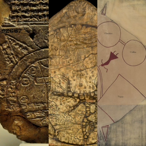
Three Historic Maps
urhere
03/10/21 • 31 min
Babylonian Map of the World 0:21
Hereford Mappa Mundi 14:20
Catawba Deerskin Map 21:40
Babylonian Map of the World
What does this map have to do with unicorns, mermaids, Ikea, and Sharpies? Incredibly we weave it all in.
Babylon is the center of the universe in this map. It’s one of the oldest known maps, it’s a copy of an earlier map that has since gone missing, and it features a large circle that represents the Bitter River (ocean). We talk about cartographic symbology then vs. now. Do the triangles represent mountains? Did the Babylonians invent the Sharpie? Have you ever seen a mythological being that is a cross between a unicorn and a mermaid on a map? Might this be the first story map?
Hereford Mappa Mundi (T and O Maps in general)
Ptolemy, in and around 150 AD, as well as many other philosophers, showed the Earth was round. In the middle ages, T and O maps ignored this and showed the Earth as flat. T and O maps aren’t geographically accurate but the T shape we find on them usually represents the Mediterranean Sea and the Nile River, the O usually represents the Earth, and the three segments created by the T inside the O represent the three major known regions, with the center being Jerusalem.
The Hereford Mappa Mundi, a T and O map, is from 1300 AD and is notable for being printed on a very large vellum (animal skin). It survived bombings so it is nice that we still have it. The materials that maps are made on are important and scholars believe we’ve probably lost a lot of maps due to the ephemerality of those materials.
Catawba Deerskin Map
This is a fairly simple map that uses squares and circles, a symbology that we find interesting in that the squares represent European settlements and the circles represent Native Nations, connected with paths to show trade routes between the two. This map is what we would call a world view, meaning that it doesn't represent exact locations but rather a view of how those locations relate to one another for a specific purpose, in this case trade. The beautiful symbology on the map that denotes, for example, a hunting ground, is worthy of attention. Native Americans have a long mapping tradition and we are lucky that a few historic pieces, including this map, have survived to today.
03/24/21 • 43 min
How do map data and map design affect bias? Does it matter if the bias is intentional or not? Honesty is the cornerstone virtue of ethics. These considerations are discussed with respect to three specific political maps but the concepts are widely applicable to most mapping endeavors.
Maps and Links
USA 2016 MTC Election Map [3:21]
Gerrymandering - The Atlas of Redistricting Article [12:24]
Victory Through Airpower 1943 Video [25:18]
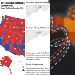
USA 2016 MTC Election Map
Election time in the U.S. tends to be a fun and exciting time to watch newscasters point to maps on TV as they show election results. This particular election map shows counties in either a solid red or a solid blue color depending on the results of the 2016 presidential election. But counties vary in size greatly across the U.S. and herein lies the issue: a county that is quite large-in-size might have a few thousand people in it whereas a small-in-size county, on the East Coast for example, might have 40,000 people in it. The larger county carries more visual weight than the small one even though this does not reflect the number of voters in those counties. Historically, U.S. presidential maps were often shown this way, except for the occasional bulbous-looking cartogram, which is a type of map that distorts geography depending on numeric values within the geographic units [7:18].
Modern-day elections maps have been getting a lot better at showing the data in a more accurate way. In 2020, in particular, the U.S. election maps were highly varied. We saw some attempts at more diagrammatic maps like grids of states where each state was an equally sized square, which at least equalizes the geography. But some of the maps go further. For example, value by alpha maps use the correct geography but vary the alpha-channel, or transparency, of the blues and reds such that the color is more transparent where there are less people and more opaque where there are more people [8:50]. You can take the value by alpha map style even further by displaying the colors as a mixture of red and blue so that a place that is, for example, shown as purple, would indicate that there is more of a 50/50 mixture of votes for each party in that location.
Gerrymandering - The Atlas of Redistricting Article
Gerrymandering is the act of drawing a voting district boundary such that it includes just the right proportion of voters for a particular party to enable that party to benefit [14:34]. The Supreme Court ruled that both parties are at fault with respect to gerrymandering [15:22].
There is a concept in mapping called the Modifiable Areal Unit Problem (MAUP), where you have point data (in our case, with gerrymandering, these are really people points, or where those people live) that you are aggregating, and depending on where you draw your aggregation lines, you may get vastly different statistics out of the data [17:00]. In mapping, if the cartographer decides to re-draw aggregation units in order to make the map look a certain way that is inconsistent with the data, this would be an intentionally biased map [19:26]. Maps are authoritative documents, with the implication being that cartographers have a responsibility to ensure maps are designed as correctly as possible [21:10].
Note that the example at [23:22] would have been better if it had been laid out as splitting the Denver area into the same number of districts in both cases. If a party has a lot of rural voters it could be tempted to create districts that have small portions of the city and larger portions of rural areas (probably resulting in elongated districts) whereas a party that has a lot of city voters could be tempted to draw districts that included enough city dwellers to skew them toward that party.
Victory Through Airpower 1943 Video
This is an animated persuasive movie trailer that has a lot of visuals depicting dangerous things happening with respect to war. It evokes feelings via dramatic sounds and visuals. Maps have the power to persuade and do indeed do so in this video. The map that starts 12 seconds in on the trailer is animated in the sense that the Ken Burns effect is used to sweep the camera across an image. There are also animations on the map in the more traditional sense of the word animation; the edges of polygons move in order to draw attention to them. Note that it was incorrectly asserted in this segment that the map only animates once the camera gets to Japan, whereas in actuality it also is animated at the beginning of the camera sweep.
Th...
Three More Historic Maps
urhere
04/14/21 • 45 min
List of Maps
Coastal map of Shandong, Zhili, and Shengjing [1:40]
The Ottoman Mappa Mundi of Haci Ahmet [19:37]
Marshall Islands Stick Chart [33:01]
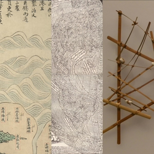
Coastal Map of Shandong, Zhili, and Shengjing
This is a Chinese scroll map painting, captured in 6 separate images on the Library of Congress site in order to fit in the whole length of it. Historically these kinds of scrolls depicted stories, epics, activities, and generally just daily life and, unlike posters of maps from the Western world that are meant to be seen on a wall, these are meant to be seen only occasionally. This is a Makimono scroll, meaning it’s in a landscape orientation. The way the lines curve and move harmoniously on this map--your eyes follow along, horizontally--and, even with the repetitive symbology, you just want to continue looking along the length of it. It’s also an informational map, however, with a good balance of labels to features.
The labels show where certain guards and river forts are, and could have been useful for military purposes. When we first looked at this we were trying to figure out if the blue swirls that dominate the top half of the scroll are mountains or ocean waves but a lot of these maps, like this one, face the ocean with land on the bottom, which is typical in this era and so it seems clear on further inspection that the curvy symbols are beautiful ocean waves. This long-form map style is a great format for any kind of linear feature that you are trying to map, whether a coastal area, a riverine area, or a mountain range.
The way you associate with the geography on this map allows you to really view it as a type of story in contrast with a birds’ eye view map. It also is a much more useful way of looking at a coastline for certain purposes. Also, hats off to the person who’s effort went into making those waves! Every map has an artistry to it and this one reminds us of that fact. Maps are more than just data and information, they are things that we use to tell people the story of that data, and if they aren’t designed well then people won’t look at them or understand them, and that is why aesthetics in mapping matter.
The Ottoman Mappa Mundi of Haci Ahmet
“Holy cannoli this is just beautiful!” may have been uttered about this label-rich, information-filled map. Notably, all of this beauty is achieved with just black line-work. It’s a very large map on 10 pages pasted together, or 36” by 36”. This was not an original of Haci Ahmet, probably a pseudonym, who translated it into Turkish in 1559. The reason for the translation was to give it to Ottoman princes, who may have been searching for locations to colonize at the time. It’s in a heart-shaped projection called cordiform that we don’t see too often today.
The label that stretches all the way down the coast from North America to the end of South America is wonderful and is representative of the rest of the labels on this map in that they all carefully follow the contours of the geography. A lot of the line fills and stipple patterns are expected of woodcut maps like this but it is also surprisingly detailed. Some speculation as to the name of the opposum-fish-like creature in the lower-left celestial sphere happens. It is noted that a common style of angry fish is also included on that sphere. Map monster names and meanings are discussed.
Marshall Islands Stick Chart
These stick charts were made to aid in navigation for the outrigger canoers of the Marshall Islands. These islands consist of over a thousand individual islands or islets so one can imagine how nice it would be to have knowledge of those island locations in the form of charts like these. They’re made from the center spines of coconut fronds that are connected by shells that represent islands.
While this map style is quite different from what cartographers are used to seeing and creating in the modern day, they are exactly what maps are supposed to be--spatial references of the world, helping us understand the world, and giving us the means to share that information. Furthermore, using woody materials and shells to create symbology is just really cool. The coconut sticks represent ocean patterns, which is important in a region where a multitude of islands disrupt the regular ocean current.
While it is purported that only the individual map maker could use one of these maps, we feel like this may not be completely true as evidenced by the common symbology, methods, and materials used in the stick charts across the islands. These maps were made from the time of the 2,000 BC all the way up until WWII in this region and we surmise that the information ...
Show more best episodes

Show more best episodes
FAQ
How many episodes does urhere have?
urhere currently has 12 episodes available.
What topics does urhere cover?
The podcast is about History, Earth Sciences, Podcasts, Science and Geography.
What is the most popular episode on urhere?
The episode title 'Three Advertising Maps' is the most popular.
What is the average episode length on urhere?
The average episode length on urhere is 41 minutes.
How often are episodes of urhere released?
Episodes of urhere are typically released every 7 days.
When was the first episode of urhere?
The first episode of urhere was released on Mar 6, 2021.
Show more FAQ
Show more FAQ