Three Natural Resources Maps
04/28/21 • 47 min
Links
Map of the Rivers Huallaga, Ucayali & Amazon [1:53]
View of the Panamint Range Mountains, mines, mills and town site [14:30]
The Melting of Antarctica [31:20]
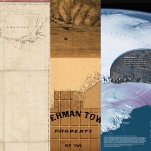
Map of the Rivers Huallaga, Ucayali & Amazon
This is a very wide map due to the shape and length of the river system, leaving the rest of this composition sparsely designed, excluding the graticule, and therefore quite unique. Hernon William Lewis, the main cartographer for this map published in 1851, was in the U.S. Navy and was an explorer, exploring “uncharted territory” of the Amazon. We note that the phrase “uncharted territory” is very specific to where the cartographer is from and here what it means is that it was yet to be explored by the United States.
The mountains here are another example of caterpillar mountain relief styling, a term brought up in a previous episode, and which we now assume is part of the permanent lexicon of the cartographic elite. We also see a nice technique whereby dotted lines allude to the continuance of the tributaries onward upstream even though their entireties are not drawn. Some figure-ground issues could affect the reader as there aren’t a lot of visual cues such as water ripples, trees, or other symbols to cue the land versus the water, though there is a thickness to the upper-bank of the river that helps.
In the literal big-picture, this is a river line that travels from one side of South America to the other, starting from the Amazon Basin in the east and going to Lima, Peru in the west. It’s akin to a map with a single road where all the places along it help you travel on that road but not deviate from it, such as the Itinerary from London to Beauvais, discussed in the Three Tourist Maps episode. Note that to accommodate the span of this river system, the overall map is made from 30 different pieces of paper that are mounted on a cloth.
View of the Panamint Range Mountains, mines, mills and town site
This is a very unique informational/poster layout because we see the mountain range from a front-view and then we also see a top-down map view of the area at the bottom (though this characterization is debated at the end of this section). Panamint was a short-lived town and is now a bonafide ghost town. In fact, it was a town for only a couple of years before the whole place flooded.
The texture for the salt marsh patterning is really amazing and ties in with work that cartographers do today since modern vector maps often employ repeating patterns for various landcover types. There is realism shown in the mountains as well as that salt marsh.
This map is from 1875 and may be a lithograph, but hark! there’s the caterpillar hashing again! There’s a level of depth, color and texture variance that is smoother than in copper plate and woodblock prints as can easily be seen in the various sharp line-stops and the detailed smoke/steam emanating from the train. Just as today when we see differences in cartography due to what we can do with newer software, the “software” of that day had changed to lithography, and we see the changes reflected in these stylistic abilities that they were able to achieve here. Lithography generally employed the use of hydrophobic dyes applied to limestone to achieve this greater mastery of the straight-edged line among other advancements.
Panamint, California, was a silver and copper mining town, with the mines indicated with numbers on the top half of the map. As the story goes, silver was discovered by three bandits who were hiding in a cave here and subsequently laid claim to it. Senators Stewart and Jones bought the claim from them and further developed the mines, though it did not yield as much riches as some of the more famous mines of this era. A couple of years later? The town of about 2,000 was washed out in a flood. Does anyone else feel as we do that this story should be turned into a movie?
The Melting of Antarctica
This beautiful, contemporary, infographic-type map from National Geographic is primarily blue and white. Cynthia Brewer, in one of her cartography books, says that people really respond positively to blue (while not liking yellow too much) and this blue is indeed what lends beauty to this map. The ice shelves in their purplish color a...
Links
Map of the Rivers Huallaga, Ucayali & Amazon [1:53]
View of the Panamint Range Mountains, mines, mills and town site [14:30]
The Melting of Antarctica [31:20]
Map of the Rivers Huallaga, Ucayali & Amazon
This is a very wide map due to the shape and length of the river system, leaving the rest of this composition sparsely designed, excluding the graticule, and therefore quite unique. Hernon William Lewis, the main cartographer for this map published in 1851, was in the U.S. Navy and was an explorer, exploring “uncharted territory” of the Amazon. We note that the phrase “uncharted territory” is very specific to where the cartographer is from and here what it means is that it was yet to be explored by the United States.
The mountains here are another example of caterpillar mountain relief styling, a term brought up in a previous episode, and which we now assume is part of the permanent lexicon of the cartographic elite. We also see a nice technique whereby dotted lines allude to the continuance of the tributaries onward upstream even though their entireties are not drawn. Some figure-ground issues could affect the reader as there aren’t a lot of visual cues such as water ripples, trees, or other symbols to cue the land versus the water, though there is a thickness to the upper-bank of the river that helps.
In the literal big-picture, this is a river line that travels from one side of South America to the other, starting from the Amazon Basin in the east and going to Lima, Peru in the west. It’s akin to a map with a single road where all the places along it help you travel on that road but not deviate from it, such as the Itinerary from London to Beauvais, discussed in the Three Tourist Maps episode. Note that to accommodate the span of this river system, the overall map is made from 30 different pieces of paper that are mounted on a cloth.
View of the Panamint Range Mountains, mines, mills and town site
This is a very unique informational/poster layout because we see the mountain range from a front-view and then we also see a top-down map view of the area at the bottom (though this characterization is debated at the end of this section). Panamint was a short-lived town and is now a bonafide ghost town. In fact, it was a town for only a couple of years before the whole place flooded.
The texture for the salt marsh patterning is really amazing and ties in with work that cartographers do today since modern vector maps often employ repeating patterns for various landcover types. There is realism shown in the mountains as well as that salt marsh.
This map is from 1875 and may be a lithograph, but hark! there’s the caterpillar hashing again! There’s a level of depth, color and texture variance that is smoother than in copper plate and woodblock prints as can easily be seen in the various sharp line-stops and the detailed smoke/steam emanating from the train. Just as today when we see differences in cartography due to what we can do with newer software, the “software” of that day had changed to lithography, and we see the changes reflected in these stylistic abilities that they were able to achieve here. Lithography generally employed the use of hydrophobic dyes applied to limestone to achieve this greater mastery of the straight-edged line among other advancements.
Panamint, California, was a silver and copper mining town, with the mines indicated with numbers on the top half of the map. As the story goes, silver was discovered by three bandits who were hiding in a cave here and subsequently laid claim to it. Senators Stewart and Jones bought the claim from them and further developed the mines, though it did not yield as much riches as some of the more famous mines of this era. A couple of years later? The town of about 2,000 was washed out in a flood. Does anyone else feel as we do that this story should be turned into a movie?
The Melting of Antarctica
This beautiful, contemporary, infographic-type map from National Geographic is primarily blue and white. Cynthia Brewer, in one of her cartography books, says that people really respond positively to blue (while not liking yellow too much) and this blue is indeed what lends beauty to this map. The ice shelves in their purplish color a...
Previous Episode
Three Garden Maps
Links:
Garden maps twitter discussion [0:20]
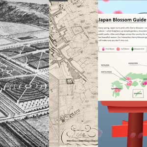
Chatsworth House 1699 [2:17]
Bourge Castle and Gardens 1697 [17:35]
Japan Cherry Blossom Guide [35:25]
Molly O’Halloran’s garden map [53:14]
Chatsworth House 1699
Here we have another black and white map that manages to be highly detailed despite its lack of color! The map presents a garden at its earliest stages, consisting of 105 acres, and has since been cultivated for 500 years. It’s constantly changing and belongs to the Dukes of Devonshire. Kip and Knyff, the map makers, were well known engravers of English Country house designs and this copperplate engraving really shows off the finer line textures and softer features in certain areas like the background that are possible with copperplates rather than the earlier woodblock technology. Imagine having someone engrave a depiction of your home and garden!
We don’t usually work with maps at this scale so it is refreshing to us to see individual trees. We note the garden is in the Dutch Baroque style. Garden maps tend to have a nice symmetry to them, partly if they are in a certain style of garden, but also because the features are made from the map instead of the other way around. With garden maps, you usually design the map first, and then plant the garden. But with other maps, like for example, the cities of North America or the arboreal forests of the world, you are mapping features that are already there and don’t necessarily have any order or symmetry to them. While cartographers strive for artistic balance this is a limitation we must work within. An analogy between garage sales and posh retail stores happens.
We mention a link to the satellite view of this same area so you can see how it looks today. Here is that link.
There’s tons of texture on this map which is part of what makes it so lovely. In the early 2000s we didn’t have a lot of texture on maps, which was a limitation of old geo software, but now we can definitely add texture to maps so this old map provides good inspiration. It’s noted that the deer park, we are sure, would have been for watching the deer, not hunting them. Ahem. The oblique view is off-center and not centered on the castle structure; the dark and dense maze-like feature pulls your eye toward the right, which is a shift of focus that we’re not used to and helps you sweep across and analyze the whole map. This truly was a map of the gardens, not of the castle. The line pattern in the water, with darkening at the curves, is intentional and is something we do in today’s maps to provide depth, artistry and realism.
Bourge Castle and Gardens 1697
This beautiful copperplate engraving with an oblique shift is similar to the Chatsworth map in terms of the use of patterns but is a different aesthetic in that it is a lot brighter, with fewer heavy textures. The roads are cut out from the texture in a clean way that is appealing to the eye. This is a way to do texture without it feeling too heavy. Texture can be hard to do because if you have features that are large or imbalanced then it is jarring or even dizzying. Hatching, or diagonal lines, are kept to smaller area features here, which is the way to do hatching well. Patterns and textures can so quickly overpower a map and make it feel visually stressful. But here the lines are really thin, and when you’re looking at the entire piece, the lines condense, creating a feel of a single color fill. In this light, we check out the patterns of the fields, fences, and even the cemetery to figure out what’s going on in them.
This is a map that people today would be tempted to make a legend for, since there are so many different patterns, each ostensibly representing an individual type of feature. With today’s software making it so easy for cartographers to automatically add legends, it ends up being an automatic thing. But if we think about what truly matters to the reader for their understanding of a map, if it is something that the reader really needs to interpret then sure, put it in a legend, but otherwise leave it out. Indeed we do see a growing movement, especially in news publications, to exclude legends more and more and instead to just label the items on the map directly. This technique minimizes eye movement (i.e., no legend-map-legend scanning) for the reade...
Next Episode
Three Video Game Maps
Links
Zelda, Breath of the Wild [2:08]
Ori and the Will of the Wisps [15:53]
Animal Crossing [28:22]
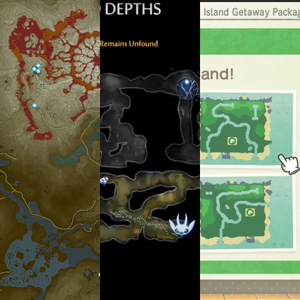
Zelda, Breath of the Wild
One of the first things you notice about this game map is that it has a lot of green hues and resembles camouflage, giving you the immediate sense that this will be a nature-based type of game. Multitudinous contour lines further this outdoorsy feeling but also provide much needed assistance to the gamer, since in this game you need them, just as you would in real life, to determine how easy or how difficult navigation will be in certain areas. An action-adventure game that was released in 2017, this game is still really popular today. It’s an open-world type of game, which means you discover things as you go and at your own pace, making the map an important piece of the gaming experience. Critics called this a “landmark open world design,” which is literally based off the map. The character you play, Link, doesn’t know who he is. He needs to learn who he is as he explores and also, by the way, has to try and save the world as well.
Interesting features on the game map include a labyrinth and volcano, both easily understood from the symbology and coloration. Dark green is used for the land at sea level and a lighter green is used for the tops of the hills and mountainous regions. This kind of gradual color scheme that corresponds to the elevation contours is called hypsometric tinting: a technique whereby you aid the map reader’s understanding of the isolines (in this case the isolines are specifically contour lines) by tinting within the bands or groups of bands with a graduated color scheme. This visual reinforcement helps when you are zoomed out and, given the level of detail on the map, it helps a lot with context. You see this with the water coloration as well, which is called bathymetric tinting. In the major digital basemaps of today you’ll see that bridges usually have some sort of special treatment, whether it is a darker casing or a darker line color, and that is just what we’re seeing here: a very dark green on the bridges whereas the main road is in a lighter green. They are also shown with posts and other structural features that help you understand what they are.
Building outlines and other built structures are also shown when you zoom quite a bit in, giving the player clues as to where towns or cities are for talking with other characters and making purchases. By contrast, forested areas are fluffy puffs of polygons denoting overlapping tree canopies. These are essentially merged polygons and were probably intentional in that the generalization probably helps to keep performance optimal by lessening the amount of data and thereby load time.
Ori and the Will of the Wisps
This is a platform adventure game, not an open-world game, and was very well received, especially for its visual quality. It emphasizes exploration. There are cartographer characters in this game! As a player, you get maps from these cartographers, which, while you can explore the game without a map, help you to have a reference point for where you’ve been. Players also don’t know certain places exist without the maps and, as in real life, they help you see what areas could be dangerous. Looking at the tunnels closely you see they are very detailed and have a certain vibrancy. The color of each tunnel in general aligns with the played-world, it corresponds with the color hues.
The whole aesthetic of the glowy, white, wispy character and the vibrancy of the colors against a dark background reminds us of Firefly Mapping, where you take a point based dataset and create glowy dots that appear on top of a dark, maybe black, background. These subtle design choices with the soft glows are really special as the glowing serves to highlight things like when a symbol is selected. We also see a line that shows you where Ori moved and jumped, basically a path that shows where you just were. This is a useful animation technique for mapping to show where things have been. Remember the Harry Potter map with the footprints that we discussed in Three Pop Culture Maps? This is a similar concept. You can see this type of animation in today’s journalism maps, such as animations of flight paths that trail and slowly dissipate.
Animal Crossing
These are some very square islands! The maps for this non-story-based game are very simple and cartoonish, both aesthetics mirroring the simplicity and cartoon nature of a game where you interact with other cute villagers, make some trades, and socialize. This game really took off during the pandemic as it gave people a ...
If you like this episode you’ll love


Episode Comments
Generate a badge
Get a badge for your website that links back to this episode
<a href="https://goodpods.com/podcasts/urhere-426172/three-natural-resources-maps-58696155"> <img src="https://storage.googleapis.com/goodpods-images-bucket/badges/generic-badge-1.svg" alt="listen to three natural resources maps on goodpods" style="width: 225px" /> </a>
Copy