Three Historic Maps
03/10/21 • 31 min
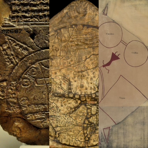
Babylonian Map of the World 0:21
Hereford Mappa Mundi 14:20
Catawba Deerskin Map 21:40
Babylonian Map of the World
What does this map have to do with unicorns, mermaids, Ikea, and Sharpies? Incredibly we weave it all in.
Babylon is the center of the universe in this map. It’s one of the oldest known maps, it’s a copy of an earlier map that has since gone missing, and it features a large circle that represents the Bitter River (ocean). We talk about cartographic symbology then vs. now. Do the triangles represent mountains? Did the Babylonians invent the Sharpie? Have you ever seen a mythological being that is a cross between a unicorn and a mermaid on a map? Might this be the first story map?
Hereford Mappa Mundi (T and O Maps in general)
Ptolemy, in and around 150 AD, as well as many other philosophers, showed the Earth was round. In the middle ages, T and O maps ignored this and showed the Earth as flat. T and O maps aren’t geographically accurate but the T shape we find on them usually represents the Mediterranean Sea and the Nile River, the O usually represents the Earth, and the three segments created by the T inside the O represent the three major known regions, with the center being Jerusalem.
The Hereford Mappa Mundi, a T and O map, is from 1300 AD and is notable for being printed on a very large vellum (animal skin). It survived bombings so it is nice that we still have it. The materials that maps are made on are important and scholars believe we’ve probably lost a lot of maps due to the ephemerality of those materials.
Catawba Deerskin Map
This is a fairly simple map that uses squares and circles, a symbology that we find interesting in that the squares represent European settlements and the circles represent Native Nations, connected with paths to show trade routes between the two. This map is what we would call a world view, meaning that it doesn't represent exact locations but rather a view of how those locations relate to one another for a specific purpose, in this case trade. The beautiful symbology on the map that denotes, for example, a hunting ground, is worthy of attention. Native Americans have a long mapping tradition and we are lucky that a few historic pieces, including this map, have survived to today.
Previous Episode
Welcome to Urhere
Hello map fans!
We're Gretchen Peterson and Vanessa Knoppke-Wetzel. Gretchen, an author of several books about maps, works as a cartographer making maps for clients large and small, and has been running a geo business for over 20 years. Vanessa is an expert cartographer with over 10 years of experience in private and public industry who also teaches a university class on maps and gives talks at industry conferences all over.
Want to learn more about maps from a cartographer's perspective? You've come to the right place! All kinds of maps are covered, from historic to contemporary, and all kinds of themes. Babylonia? Game of Thrones? T and O? Ocean monsters? Mercator? We cover it!
We're excited to share our passion and knowledge about maps with you. Please join us!
Next Episode
Three Projections
Map Links
Mercator 1569 World Map [2:26]
Equal Earth Political Wall Map [9:58]
Double-sided Princeton, Gott, et al Revolutionary [18:30]
Want to visualize a 3D globe on a flat piece of paper? You have to project it first. And when you project you distort someway somehow. The three maps we discuss handily represent three different projections: Mercator, Equal-Earth, and what we're going to call "Double-Sided" in these show notes.
Mercator
Is Greenland really the same size as Africa? Mercator created his projection for a single purpose: navigation on the high seas and in particular, across the Atlantic, and this projection worked very well in getting captains and their crews from point A to point B. However, this projection is now used in online maps because of its computational ease--latitude and longitude lines form rectangles in this projection--and it isn't always good for online maps depending on their purpose.
Ever the cartographers, we also pose the question: did Mercator like or loathe writing a copyright statement on his map?
Equal-Earth
Now here's a projection that was developed just a few years ago and works well for world-scale map data. We discuss why its good--Greenland and Africa are their actual size, for one. We bring up a few other projections like Gall-Peters [13:09], Robinson [14:53], and Winkel-Tripel [15:19] too. Wet laundry is hung up to dry metaphorically as well [16:20]. Two of these have been standards at National Geographic at varying times and we believe this will probably not be the last time that National Geographic is brought up, seeing as how they make beautiful maps.
Every projection is just trying to find the perfect accuracy and remove as much bias as possible for a particular use case but it is hard because any kind of flatting of the Earth will create some kind of distortion. A bad pun occurs at [15:52].
Double-Sided
This one is also called variously "The Princeton Projection" or the "Revolutionary Projection" but it does not have a standard name as of yet. If you want to read the paper that goes with this projection, as opposed to the general audience article linked to above, click here (pdf). The article refers to this projection as revolutionary and so we discuss not only what this new projection is all about but also our opinions on whether or not it is truly revolutionary. This projection is azimuthal and typically azimuthal maps, which are distorted at the equator as that is where the most stretching occurs, are set side by side but this double-sided projection--you guessed it--they are placed on top of one another.
This was the talk of the spatial world for at least a week. Two azimuthals of the poles are not revolutionary [22:00] but technically, putting them together in this way is revolutionary [22:22]. Boundary cut off problem [23:00] is solved with this projection. A ball of clay analogy [23:20] is used to explain azimuthal projections and a party store paper lantern [26:40] analogy happens.
With maps, geography and shape really matter!
If you like this episode you’ll love


Episode Comments
Generate a badge
Get a badge for your website that links back to this episode
<a href="https://goodpods.com/podcasts/urhere-426172/three-historic-maps-58696162"> <img src="https://storage.googleapis.com/goodpods-images-bucket/badges/generic-badge-1.svg" alt="listen to three historic maps on goodpods" style="width: 225px" /> </a>
Copy