Data Stories
Enrico Bertini and Moritz Stefaner
All episodes
Best episodes
Top 10 Data Stories Episodes
Goodpods has curated a list of the 10 best Data Stories episodes, ranked by the number of listens and likes each episode have garnered from our listeners. If you are listening to Data Stories for the first time, there's no better place to start than with one of these standout episodes. If you are a fan of the show, vote for your favorite Data Stories episode by adding your comments to the episode page.

07/14/16 • 25 min
This week Mimi Onuoha joins Moritz on the show for a project episode from the Eyeo Festival. Mimi is a Brooklyn-based artist and researcher, and currently a Fellow at the Data & Society Research Institute.
Mimi is fascinated by the moment when data get collected — by what can be captured in that moment, and what goes unseen. As a Fulbright-National Geographic Fellow, Mimi developed Pathways, a data storytelling project on a month’s worth of mobile data from a small group of Londoners. Using a quasi-ethnographic approach, the project reflects not only the individuals’ mobile metadata, but also their experiences becoming data subjects.
On the show, we discuss Mimi’s process recruiting both friends and strangers to become her data subjects, her experience developing personal relationships with each of them, and their reaction to the final product.
http://datastori.es/wp-content/uploads/2016/07/Mimi-Onuoha-promo.m4vThis episode of Data Stories is sponsored by Qlik, which allows you to explore the hidden relationships within your data that lead to meaningful insights. Ever wondered what it costs to live in Singapore or Sydney? Check out the Qlik Sense app “Cost of Living” to answer that question and many others! And make sure to try out Qlik Sense for free at: qlik.de/datastories.
LINKS
- Fulbright-National Geographic Fellowship
- Data and Society Research Institute
- Open Paths app
- Moves app owned by Facebook
- Reveal.js slideshow software
004 | Malofiej 20 (with Andy Kirk)
Data Stories
03/30/12 • 69 min
We have our first guest on the show! Andy Kirk and Moritz just came back from Malofiej 20, the Infographic World Summit, and we used the chance to discuss our impressions of the event — the conference, the awards, the workshops and the general vibe.
Breakdown of the episode
[00:00:00] Intro and welcome to our guest Andy “Not McCandless” Kirk from visualisingdata.com
[00:02:31] Malofiej: what is it, how did we there and some history
[00:07:20] Pamplona lifestyle
[00:08:42] Stockholm syndrome or best friends forever?
[00:10:08] Conference talks in short
[00:10:23] Gonzalo Peltzer
[00:12:12] Andrew Vande Moere
[00:14:02] Moritz Stefaner (slides) [00:16:13] Andy “Big Data” Kirk (slides) [00:23:00] Sheila Pontis
[00:25:15] Bryan Christie
[00:27:39] Simon Rogers
[00:28:47] Robert Kosara
[00:30:44] Alberto Cairo
[00:31:59] Anne Gerdes, Nora Coenenberg
[00:33:42] Nigel Holmes
[00:35:20] Matthew Bloch
[00:37:15] Ginny Mason
[00:39:14] Carl DeTorres
[00:41:34] Jaime Serra
[00:44:17] Sergio Pecanha
[00:45:50] Mario Tascon (@mtascon)
[00:46:43] The awards
Winner list (pdf)
Gold medals with Jury remarks
All online winners with links [colorful-data.net]
[00:49:49] New York Times dominates
[00:51:22] Best of show: Guantanamo Detainees
Print piece (and some background info)
Online
[00:53:49] New York Times again
[00:58:17] Internet Group do Brasil
[00:58:49] Resumé
[01:03:02] What is an information graphic, after all?
Images of the Devastation Along Misurata’s Main Road
Part Ape, Part Human
[01:05:25] We should all submit our online works
[01:06:27] We just can’t finish
The jury + speaker crowd
More on Malofiej 20
25 lessons learned Bryan Christie’s initial thoughts, and more thoughts Robert Kosara’s perspective Andy Kirk’s reflections
10/29/15 • 65 min
We have Assistant Professor Chris Collins from University of Ontario Institute of Technology on the show to talk about text visualization. Chris explains what Text Vis is, provides examples from his and others’ work, describes tools and knowledge to get started, and looks into the future of the field, including its challenges and opportunities.
And here’s a really cool new thing — we have a transcript of the whole show! Browse the text, search for quotes and chapters, and maybe even... visualize it? Let us know if it’s useful!
Enjoy the show!
LINKS
- Chris Collins and His Lab
- FluxFlow (twitter rumors detection and visualization) | See also “How riot rumours spread on Twitter” (from the Guardian)
- Probing Projections Project
- DocuBurst
- Patterns in Passwords
- Book: “Graphs, Maps, and Trees”
- Lexichrome (visualizing the color of words)
- Literature Fingerprinting (showing how different authors write) (PDF)
- Visualizing Text Readability (PDF)
- Text visualization browser (collection/taxonomy of text vis projects) [good place to start looking into text vis!]
- NLTK (Natural Language Toolkit)
- Wordnet
This episode is sponsored by Qlik who allows you to explore hidden relationships within data that lead to insights. Check out the virtual event on Nov 18: Are you seeing the whole story that lives within your data? You can download Qlik Sense for free at: www.qlik.de/datastories.
Related episodes
05/27/15 • 60 min
[This episode of Data Stories is sponsored by Tableau. You can download a free trial at http://tableau.com/datastories – check the new Tableau 9!]
Hi all!
We have Miriah Meyer with us in this episode to talk about how to build interactive data visualization tools for scientists and researchers. Miriah is Assistant Professor at University of Utah and one of the leading experts on the process of designing data visualizations for scientific discovery.
To know more about her, take a look at her talk at TEDxWaterloo and her projects page, where she has numerous links to applications she developed in biology and other domains (see for instance MizBee and Pathline).
On the show we talk about her work on analyzing and understanding the design process: required steps, major pitfalls and tips on how to collaborate with domain scientists.
We also talk about her recent fascinating ethnographic work on “Reflections on How Designers Design With Data” and her ongoing work on building visualization tools for poetry!
Enjoy the show!
LINKS
- Miriah’s Home Page
- Miriah’s Projects
- TEDxWaterloo – Miriah Meyer – Information Visualization for Scientific Discovery
- Paper: How Designers Design With Data [ethnographic study]
- Paper: Design Study Methodology: Reflections from the Trenches and the Stacks [on the visualization design process]
- Paper: Visualization Collaborations What Works and Why
- The Lyra Visualization Design Environment (VDE)
- Paper: Overview: The Design, Adoption, and Analysis of a Visual Document Mining Tool For Investigative Journalists – Matthew Brehmer, Stephen Ingram, Jonathan Stray, and Tamara Munzner [one rare case of adoption study]
01/15/16 • 40 min
Happy New Year everyone, we are back!
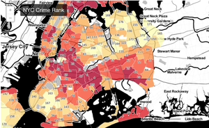
In this episode we talk with Ben Wellington about his blog I Quant NY, where he writes about surprising facts he finds analyzing NYC open data.
Some of his stories include how he discovered that “... Software in Half of NYC Cabs Generates $5.2 Million a Year in Extra Tips,” ideas on “How to Fix NYC’s No-Cabs-At-4PM Problem” and “How NYC Open Data and Reddit Saved New Yorkers Over $55,000 a Year” by detecting fire hydrants that generate too many parking tickets.
On the show Ben talks about how he generates new ideas, how he finds and analyzes the data, and how he turns this into amazing stories for his blog. We also talk about the impact his work had on New York City and the interesting reactions some of his blog posts have generated.
Enjoy Ben and his amazing NYC data stories, and read a transcript of our interview here!
This episode of Data Stories is sponsored by Quadrigram, a web based application designed to bring data stories to life. With Quadrigram you can create and share interactive data stories without the need of any coding skills.
LINKS
Moritz’s project on place names – http://truth-and-beauty.net/experiments/ach-ingen-zell/
Our Guest Ben Wellington – https://about.me/benwellington
I Quant NY – http://iquantny.tumblr.com
Some favorite I Quant NY posts:
- “You’ll Never Guess the Cleanest Fast Food Joint in NYC”
- “Half of Manhattan is Within 4 Blocks of a Starbucks”
- “How Software in Half of NYC Cabs Generates $5.2 Million a Year in Extra Tips”
- “How to Fix NYC’s No-Cabs-At-4PM Problem”
- “Success: How NYC Open Data and Reddit Saved New Yorkers Over $55,000 a Year”
Tools Ben uses for I Quant NY:
- iPython: http://ipython.org/
- iPython Notebook Pandas: http://pandas.pydata.org/pandas-docs/stable/tutorials.html
- QGIS: http://www.qgis.org/en/site/
- CartoDB: https://cartodb.com/
11/20/19 • 62 min
We have Tamara Munzner from the University of British Columbia, Vancouver, and Robert Kosara from Tableau Research on the show to go through some of our personal highlights from the IEEE Visualization Conference 2019. We talk about some of the co-located events, some of the technical papers and major trends observed this year. Make sure to take a look at the links below, there is a lot of material! And especially the videos. There are quite a few that have been posted online this year.
Enjoy the show!
[Our podcast is fully listener-supported. That’s why you don’t have to listen to ads! Please consider becoming a supporter on Patreon or sending us a one-time donation through Paypal. And thank you!]
LINKS:
Main IEEE VIS conference website
Events: Infovis X Vision science
Mentioned speakers: Timothy Brady, Darko Odic, Jeremy Wolfe
Visualization for Communication workshop: VisComm
BioVis@Vis workshopMentioned speakers: Martin Karpefors, Sean Hanlon, Erin Pleasance
Visualization in Data ScienceMentioned speakers: Been Kim, Google Brain, Andrew Gelman, Jenny Bryan
Technical Papers – The Test of Time
Jark J. van Wijk et al.: Cluster and Calendar based Visualization of Time Series Data
Tamara Munzner: A Nested Model for Visualization Design and Validation
Reflections and provocations
Miriah Meyer, Jason Dykes: Criteria for Rigor in Visualization Design Study
Paper / Video
Arvind Satyanarayan et al.: Critical Reflections on Visualization Authoring Systems
Jagoda Walny et al.: Data Changes Everything: Challenges and Opportunities in Data Visualization Design Handoff
Evanthia Dimara, Charles Perin: What is Interaction for Data Visualization?
Visual perception and cognition
Robert Kosara: Evidence for Area as the Primary Visual Cue in Pie Charts
Jessica Hullman: Why Authors Don’t Visualize Uncertainty
Visualisation for machine learning
Àngel Alexander Cabrera: FairVis: Visual Analytics for Discovering Intersectional Bias in Ma...

11/21/22 • 57 min
Finally, this year we managed to record another classic episode from the IEEE VIS Conference (we recorded a total of 10 with this one!) We have Data Stories’ friend Prof. Tamara Munzner with us to talk about the conference and to highlight a few things she picked from the many events that happened over this week-long event.
Links
- IEEE Vis ’22
- Our guest: Tamara Munzner
- VIS Keynote: Marti Hearst – Show It or Tell It?
- VIS Capstone: Kerry Magruder – Galileo’s Telescope Discoveries: Thinking Visually in the History of Science
- Keynote BELIV workshop: Casey Fiesler – Data Is People, Research Ethics Beyond Human Subjects
- VAST 10 Year Test of Time Award: Enterprise Data Analysis and Visualization: An Interview Study
- InfoVis 10 Year Test of Time Award: Design study methodology: Reflections from the trenches and the stacks
- Paper: HiTailor: Interactive Transformation and Visualization for Hierarchical Tabular Data
- Paper: Dashboard Design Patterns
- Book: AK Peters Visualization series
- Paper: VegaFusion: Automatic Server-Side Scaling for Interactive Vega Visualizations
- Paper: Plotly Resampler: Effective Visual Analytics for Large Time Series
- Paper: Visualizing Graph Neural Networks with CorGIE: Corresponding a Graph to Its Embedding
- alt.VIS workshop
- Jo Wood’s visual essay “Beyond the Walled Garden“
- Paper: Affective Learning Objectives for Communicative Visualizations
Related episodes
- from Visweek 2012
- IEEE VIS'13 Highlights w/ Robert Kosara
- IEEE VIS'14
- Tamara Munzner
- IEEE VIS’15 Recap with Robert Kosara and Johanna Fulda
- Highlights from IEEE VIS'16 with Jessica Hullman and Robert Kosara
- Review of IEEE VIS’17 with Jessica Hullman and Robert Kosara
- Highlights from IEEE VIS 2018
- Highlights from IEEE VIS'19 with Tamara Munzner and Robert Kosara
- Highlights from IEEE VIS'20 with Miriah Meyer and Danielle Szafir
999 | Announcement: Data Stories is back!
Data Stories
09/08/22 • 2 min
The title says it all. Excited to reboot!
042 | Santiago Ortiz
Data Stories
11/14/14 • 71 min
Hey folks we have some news: Now, for the first time, Data Stories has a sponsor. Tableau Software will be sponsoring a number of episodes starting with this one. You will hear the specifics in the audio but this is good news for everyone. The content will not change, but we will be able to create a higher-quality show. And, by the way, we will also be able to pay a fee to our audio editors who have done a lot of free work for us so far (thanks Nathan and Fabricio!)
You can try Tableau following this link: www.tableausoftware.com/datastories.
Hi all, we have the great Santiago Ortiz with us again in this episode.
Santiago builds interactive data visualizations to “get deep insight from data, solve real problems and answer strategic questions.”
If you are an avid DS follower you may recall that we had him on the show in episode 19. In this episode he comes back to talk with us about visualization and data science, how he strives to create value out of his data visualization projects and how he is *not* interested data visualization!
Enjoy the show!
LINKS
- Lostalgic – Santiago’s visualization of LOST TV show scripts
- Book: The Visual Organization (on how vis is used in companies)
- Tamara Munzner’s design studies web collection (see under the heading “update”)
- Miriah Meyer’s visualization design research
- Book: Data Science for Business
- Book: Python for Data Analysis
- Book: Programming Collective Intelligence
09/24/15 • 69 min
Hey folks, we are back! We really hope you had a good summer.
We start the new season with an “internal” episode. We give numerous updates on Data Stories. Things have changed recently — we have future ideas and two great events to get in touch with us!
- The Visualized Conference, taking place in New York on Oct 7-10, 2015, is going to host a Data Stories Meetup on Oct 7, 2015. If you live in NYC or happen to be around please drop by! We’d love to meet and talk with you.
- We will also offer an Ask Me Anything on Reddit on November 3. This is a unique opportunity to ask us questions live and chat together.
In the show we also talk about some of our recent projects.
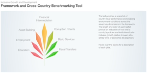
Moritz talks about False Positive, an art project on data, privacy and identity. He also talks about the new Inclusive Growth Report from the World Economic Forum, for which he designed the graphics and website together with Stefanie Posavec and 9elements.
Enrico talks about the RevEx tool and his collaboration with ProPublica for the analysis of millions of medical Yelp reviews, his work with Human Rights experts and a recently published paper on visualization design with climate scientists.
This episode is sponsored by Qlik who allows you to explore hidden relationships within data that lead to insights. Read Patrik Lundblad’s blog posts on the three pillars of data visualization(1,2,3). You can download Qlik Sense for free at: www.qlik.de/datastories.
LINKS
- John Swabisch’s PolicyViz Podcast
- Data Skeptic Podcast (Enrico’s favorite data podcast)
- List of Data Science Podcasts – “The 7 Best Data Science and Machine Learning Podcasts“
- Data Stories Meetup at Visualized in NYC (sign-up here!)
- Data Is Beautiful on Reddit (where our Ask Me Anything will happen)
- False Positive (Moritz’s project on personal data on the web)
- RevEx (Enrico’s project on analyzing healthcare reviews from Yelp)
- Inclusive Growth (Moritz’s project on visualizing growth)
- Upcoming Conferences: VIS’15 | Kikk Festival | art+bits festival
Show more best episodes

Show more best episodes
FAQ
How many episodes does Data Stories have?
Data Stories currently has 172 episodes available.
What topics does Data Stories cover?
The podcast is about Visual Arts, Podcasts, Technology and Arts.
What is the most popular episode on Data Stories?
The episode title '160 | Visualizing COVID-19 with Carl Bergstrom' is the most popular.
What is the average episode length on Data Stories?
The average episode length on Data Stories is 55 minutes.
How often are episodes of Data Stories released?
Episodes of Data Stories are typically released every 15 days, 19 hours.
When was the first episode of Data Stories?
The first episode of Data Stories was released on Feb 14, 2012.
Show more FAQ
Show more FAQ