060 | Upcoming DS Events and Some of Our Recent Projects
09/24/15 • 69 min
Hey folks, we are back! We really hope you had a good summer.
We start the new season with an “internal” episode. We give numerous updates on Data Stories. Things have changed recently — we have future ideas and two great events to get in touch with us!
- The Visualized Conference, taking place in New York on Oct 7-10, 2015, is going to host a Data Stories Meetup on Oct 7, 2015. If you live in NYC or happen to be around please drop by! We’d love to meet and talk with you.
- We will also offer an Ask Me Anything on Reddit on November 3. This is a unique opportunity to ask us questions live and chat together.
In the show we also talk about some of our recent projects.
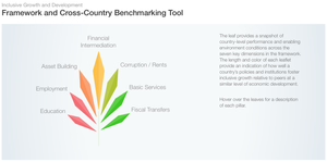
Moritz talks about False Positive, an art project on data, privacy and identity. He also talks about the new Inclusive Growth Report from the World Economic Forum, for which he designed the graphics and website together with Stefanie Posavec and 9elements.
Enrico talks about the RevEx tool and his collaboration with ProPublica for the analysis of millions of medical Yelp reviews, his work with Human Rights experts and a recently published paper on visualization design with climate scientists.
This episode is sponsored by Qlik who allows you to explore hidden relationships within data that lead to insights. Read Patrik Lundblad’s blog posts on the three pillars of data visualization(1,2,3). You can download Qlik Sense for free at: www.qlik.de/datastories.
LINKS
- John Swabisch’s PolicyViz Podcast
- Data Skeptic Podcast (Enrico’s favorite data podcast)
- List of Data Science Podcasts – “The 7 Best Data Science and Machine Learning Podcasts“
- Data Stories Meetup at Visualized in NYC (sign-up here!)
- Data Is Beautiful on Reddit (where our Ask Me Anything will happen)
- False Positive (Moritz’s project on personal data on the web)
- RevEx (Enrico’s project on analyzing healthcare reviews from Yelp)
- Inclusive Growth (Moritz’s project on visualizing growth)
- Upcoming Conferences: VIS’15 | Kikk Festival | art+bits festival
Hey folks, we are back! We really hope you had a good summer.
We start the new season with an “internal” episode. We give numerous updates on Data Stories. Things have changed recently — we have future ideas and two great events to get in touch with us!
- The Visualized Conference, taking place in New York on Oct 7-10, 2015, is going to host a Data Stories Meetup on Oct 7, 2015. If you live in NYC or happen to be around please drop by! We’d love to meet and talk with you.
- We will also offer an Ask Me Anything on Reddit on November 3. This is a unique opportunity to ask us questions live and chat together.
In the show we also talk about some of our recent projects.
Moritz talks about False Positive, an art project on data, privacy and identity. He also talks about the new Inclusive Growth Report from the World Economic Forum, for which he designed the graphics and website together with Stefanie Posavec and 9elements.
Enrico talks about the RevEx tool and his collaboration with ProPublica for the analysis of millions of medical Yelp reviews, his work with Human Rights experts and a recently published paper on visualization design with climate scientists.
This episode is sponsored by Qlik who allows you to explore hidden relationships within data that lead to insights. Read Patrik Lundblad’s blog posts on the three pillars of data visualization(1,2,3). You can download Qlik Sense for free at: www.qlik.de/datastories.
LINKS
- John Swabisch’s PolicyViz Podcast
- Data Skeptic Podcast (Enrico’s favorite data podcast)
- List of Data Science Podcasts – “The 7 Best Data Science and Machine Learning Podcasts“
- Data Stories Meetup at Visualized in NYC (sign-up here!)
- Data Is Beautiful on Reddit (where our Ask Me Anything will happen)
- False Positive (Moritz’s project on personal data on the web)
- RevEx (Enrico’s project on analyzing healthcare reviews from Yelp)
- Inclusive Growth (Moritz’s project on visualizing growth)
- Upcoming Conferences: VIS’15 | Kikk Festival | art+bits festival
Previous Episode
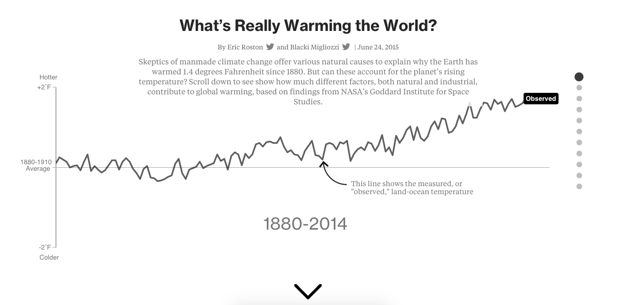
059 | Behind the Scenes of "What's Really Warming The World?" with the Bloomberg Team
“Different people, working for different institutions, in different countries, at different times, all come up with the same answer ...”
– Eric Roston, Bloomberg (talking about global warming)
Hi folks! We have Blacki Migliozzi and Eric Roston from Bloomberg on the show to talk about their recent data graphic piece on climate change called “What’s Really Warming The World?”
The graphic shows, through a “scrollytelling,” what factors may influence the world’s temperature according to well-established climate models. It guides you through a series of questions and visuals to all you to see for yourself what correlates (spoiler: carbon emissions) and what does not.
On the show we talk about how the Bloomberg team came up with this piece, their interaction with the NASA Goddard Institute for Space Studies (GISS) scientists who developed the model, and the many challenges of translating important scientific knowledge into more digestible, but not simplistic, articles that everyone can read.
We also talk about how they took inspiration from the children book “Where’s Spot?” (which is a nice narrative technique for vis!) and all the delicate design decisions they had to make.
... And don’t miss the moment when Eric drops the huge IPCC (International Panel on Climate Change) report book to give a sense of how big it is!
Enjoy the show!
—
This episode is sponsored by Qlik who allows you to explore hidden relationships within data that lead to insights. Qlik was named a Top 10 Innovative Growth Company by Forbes, and they published an interesting blog post analyzing the data from the ranking. Check it out! Qlik Sense allows you to create personalized visualizations and dynamic dashboards. You can download it for free at: www.qlik.de/datastories.
—
LINKS
- What’s Really Warming the World? – the Bloomberg graphics
- “Where’s Spot?” kids book
- The CIMIP5 Coupled Model Intercomparison Project (61 models from 28 countries evaluated and compared)
- The Intergovernmental Panel on Climate Change (IPCC) (the big tome)
- The IPCC synthesis reports (much shorter and easier to read / so many visuals could be improved!)
- Data on global land and ocean temperature records from NASA
- Scientific article on NASA GISS historical simulations
- Article on how temperature anomalies are calculated
- Datasets from the Bloomberg team:
Related episodes
Next Episode

061 | Visualizing Your "Google Search History" with Lisa Charlotte Rost
—
Hey, before we start, we ask you a favor: rate us on iTunes! This has a huge impact on how the show is ranked. To rate us on iTunes follow this link and then select “view in iTunes” (you need to have iTunes installed) and then click on “Ratings & Reviews”. You can also rate us directly from your Apple podcast player if you have one. Thanks!!!
—
Here we go with a new project episode! This time we talk with Lisa Charlotte Rost about her project “My Google Search History.”
Lisa is a visualization designer based in Berlin and the project is about how she collected and visualized her google search history to look into her personal data.
In the episode we discuss how she came up with the idea and all the steps she followed to realize it.
She has also a nice page on github with code that you can reuse to do the same thing with your own data!
Here is a set of pictures from her project:
This episode is sponsored by Qlik who allows you to explore hidden relationships within data that lead to insights. Check out the new blog post on the qlik blog called: “The role of multiple devices in our workspaces” by Donald Farmer. And, there is a big Qlik Sense Roadshow with over 100 events in Europe. You can download Qlik Sense for free at: www.qlik.de/datastories.
LINKS
- Lisa’s home page
- Lisa’s tutorial on making histograms in R
- Lisa’s tutorial on how to make your own google search visualization
- Lisa’s tutorial on text analysis with R
- Take a look at the classic Wolfram’s Personal Analytics project
- And of course see our episode with Nick Felton about his annual reports
Related episodes
If you like this episode you’ll love


Episode Comments
Generate a badge
Get a badge for your website that links back to this episode
<a href="https://goodpods.com/podcasts/data-stories-87233/060-upcoming-ds-events-and-some-of-our-recent-projects-4702402"> <img src="https://storage.googleapis.com/goodpods-images-bucket/badges/generic-badge-1.svg" alt="listen to 060 | upcoming ds events and some of our recent projects on goodpods" style="width: 225px" /> </a>
Copy