66 | "I Quant NY" Finding Surprising Stories in NYC Open Data with Ben Wellington
01/15/16 • 40 min
Happy New Year everyone, we are back!
In this episode we talk with Ben Wellington about his blog I Quant NY, where he writes about surprising facts he finds analyzing NYC open data.
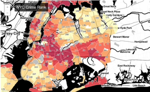
Some of his stories include how he discovered that “... Software in Half of NYC Cabs Generates $5.2 Million a Year in Extra Tips,” ideas on “How to Fix NYC’s No-Cabs-At-4PM Problem” and “How NYC Open Data and Reddit Saved New Yorkers Over $55,000 a Year” by detecting fire hydrants that generate too many parking tickets.
On the show Ben talks about how he generates new ideas, how he finds and analyzes the data, and how he turns this into amazing stories for his blog. We also talk about the impact his work had on New York City and the interesting reactions some of his blog posts have generated.
Enjoy Ben and his amazing NYC data stories, and read a transcript of our interview here!
This episode of Data Stories is sponsored by Quadrigram, a web based application designed to bring data stories to life. With Quadrigram you can create and share interactive data stories without the need of any coding skills.
LINKS
Moritz’s project on place names – http://truth-and-beauty.net/experiments/ach-ingen-zell/
Our Guest Ben Wellington – https://about.me/benwellington
I Quant NY – http://iquantny.tumblr.com
Some favorite I Quant NY posts:
- “You’ll Never Guess the Cleanest Fast Food Joint in NYC”
- “Half of Manhattan is Within 4 Blocks of a Starbucks”
- “How Software in Half of NYC Cabs Generates $5.2 Million a Year in Extra Tips”
- “How to Fix NYC’s No-Cabs-At-4PM Problem”
- “Success: How NYC Open Data and Reddit Saved New Yorkers Over $55,000 a Year”
Tools Ben uses for I Quant NY:
- iPython: http://ipython.org/
- iPython Notebook Pandas: http://pandas.pydata.org/pandas-docs/stable/tutorials.html
- QGIS: http://www.qgis.org/en/site/
- CartoDB: https://cartodb.com/
Happy New Year everyone, we are back!
In this episode we talk with Ben Wellington about his blog I Quant NY, where he writes about surprising facts he finds analyzing NYC open data.
Some of his stories include how he discovered that “... Software in Half of NYC Cabs Generates $5.2 Million a Year in Extra Tips,” ideas on “How to Fix NYC’s No-Cabs-At-4PM Problem” and “How NYC Open Data and Reddit Saved New Yorkers Over $55,000 a Year” by detecting fire hydrants that generate too many parking tickets.
On the show Ben talks about how he generates new ideas, how he finds and analyzes the data, and how he turns this into amazing stories for his blog. We also talk about the impact his work had on New York City and the interesting reactions some of his blog posts have generated.
Enjoy Ben and his amazing NYC data stories, and read a transcript of our interview here!
This episode of Data Stories is sponsored by Quadrigram, a web based application designed to bring data stories to life. With Quadrigram you can create and share interactive data stories without the need of any coding skills.
LINKS
Moritz’s project on place names – http://truth-and-beauty.net/experiments/ach-ingen-zell/
Our Guest Ben Wellington – https://about.me/benwellington
I Quant NY – http://iquantny.tumblr.com
Some favorite I Quant NY posts:
- “You’ll Never Guess the Cleanest Fast Food Joint in NYC”
- “Half of Manhattan is Within 4 Blocks of a Starbucks”
- “How Software in Half of NYC Cabs Generates $5.2 Million a Year in Extra Tips”
- “How to Fix NYC’s No-Cabs-At-4PM Problem”
- “Success: How NYC Open Data and Reddit Saved New Yorkers Over $55,000 a Year”
Tools Ben uses for I Quant NY:
- iPython: http://ipython.org/
- iPython Notebook Pandas: http://pandas.pydata.org/pandas-docs/stable/tutorials.html
- QGIS: http://www.qgis.org/en/site/
- CartoDB: https://cartodb.com/
Previous Episode

065 | What Happened in Vis in 2015? Year Review with Andy Kirk and Robert Kosara
Hey yo!
Another turn of the year is approaching and we take some time to reflect with our classic guests Andy Kirk and Robert Kosara on what has happened in 2015: “What where the major trends? Big debates? Best visualizations? New tools? Etc.” We’ve even put our predictions in writing — you can read them in our transcript of this episode here.
This was a great year for Data Stories, with a total of 22 episodes (our record so far!). We want to thank our fantastic collaborators Destry and Florian for their great support with running the show, our guests for spending time talking with us, and of course all of you for listening to Data Stories!
Happy 2016! Enjoy the holidays and we’ll see you on January with a ton of new stuff from our side. Stay tuned!
Data Stories is brought to you by Qlik, who allows you to explore the hidden relationships within your data that lead to meaningful insights. Check out a new blog post from the Qlik Blog called “People Are Smart: Data Literacy and Broad Audiences”. As you may know Data Literacy is a subject we love to talk about!
Most popular episodes
- Data Stories #56: Amanda Cox on Working With R, NYT Projects, Favorite Data
- Data Stories #52: Science Communication at SciAm w/ Jen Christiansen
- Data Stories #57: Visualizing Human Development w/ Max Roser[a]
Major Trends Of 2015
Cartogram, NPR
- Cartograms, gridded maps (Collection of links in first item here, Hexmaps, London map, Bear map)
- Machine learning / image processing, etc. (e.g. use of satellite images)
- 3D and VR (NYT Cardboard Experiment)
- Better storytelling
- Data podcasts
- Mobile vis
Major Debates/Issues
Design/Redesign
- Vis ethics: debate on aesthetizing negative data — and Sarah Slobin’s recommendations
- Data visualization criticism – Design/redesign article
- The Stephen Few / Alberto Cairo / David Mccandleuss debate
- Stephen Few’s Visualization research a pseudoscience
- Dogmatic rules vs. flexibility
Great New Visualizations
understanding neural networks through deep visualization
- Dear Data
- Hear our episode with Dear Data
- Pace of social change
- 100 years of Tax Brackets
- Draw how family income affects children’s college chances
- Visualization of what neural networks see “Inceptionism: Going Deeper into...
Next Episode
67 | ggplot2, R, and data toolmaking with Hadley Wickham
We have Hadley Wickham on the show, Chief Scientist at RStudio and Adjunct Professor of Statistics at Rice University and the University of Auckland.
Hadley created a number of hugely popular libraries for the R language, including ggplot2, which is used throughout the world to analyze and present data.
On the show we talk about his creative process to develop ggplot2, its growing popularity, other libraries he has built in the R ecosystem, and strategies for creating popular software for data analysis and visualization.
Enjoy listening to Hadley Wickham, or read the transcript from our interview here!
Data Stories is brought to you by Qlik, which allows you to explore the hidden relationships within your data that lead to meaningful insights. Take part in the Open Data Challenge for a chance to win $10,000 for an app created with Qlik Sense!
LINKS
- Project Ukko: http://www.project-ukko.net/
- Hadley Wickham: http://hadley.nz/ | https://github.com/hadley/
- ggplot2: http://ggplot2.org/
- ggplot extensions: http://ggplot2-exts.github.io
- Hadley’s R packages for data analysis (ggplot2, plyr, reshape2)
- R: https://www.r-project.org/
- tidyr: http://blog.rstudio.org/2014/07/22/introducing-tidyr/
- Visualizing travel data with TripIt: https://www.tripit.com/
- RStudio Shiny (interactive web graphics with R): http://shiny.rstudio.com/
- Functional Reactive Programming: https://en.wikipedia.org/wiki/Functional_reactive_programming
- Beautiful data visualization done with ggplot2: http://spatial.ly/2014/09/london-information-capital/
- Mike LaCour’s scandalous graphs (clearly done with ggplot2): http://science.sciencemag.org/content/346/6215/1366.full
- Wilkinson’s The Grammar of Graphics: http://www.amazon.com/The-Grammar-Graphics-Statistics-Computing/dp/0387245448
- Tableau: http://www.tableau.com/
- d3.js: http://d3js.org/
- ggvis and shiny: http://ggvis.rstudio.com/ | http://shiny.rstudio.com/
- R tutorials:
If you like this episode you’ll love


Episode Comments
Generate a badge
Get a badge for your website that links back to this episode
<a href="https://goodpods.com/podcasts/data-stories-87233/66-i-quant-ny-finding-surprising-stories-in-nyc-open-data-with-ben-wel-4702318"> <img src="https://storage.googleapis.com/goodpods-images-bucket/badges/generic-badge-1.svg" alt="listen to 66 | "i quant ny" finding surprising stories in nyc open data with ben wellington on goodpods" style="width: 225px" /> </a>
Copy