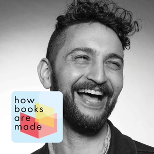
Fine lines in type design – with Thomas Jockin
09/27/24 • 35 min
Everything we read is coloured by its typeface. And humans read a lot, so font choices probably affect more people than any other field of design.
In our daily lives, we rarely appreciate how much work goes into good type decisions, and how much energy we spend accommodating bad ones.
Every day, by choice or otherwise, we read messages, posters, menus, documents, web pages, and, of course, books. Not only did someone design their layout, but someone designed the fonts in that layout. Every single letter was painstakingly designed. And every letterform has a personality: it’s trying to make you feel something, just like Comic Sans feels like silliness, and Times New Roman feels like school.
In this episode, Arthur talks to type designer Thomas Jockin. Thomas is the founder of TypeThursday, a worldwide community of type designers, and a lecturer in design and philosophy. They discuss how type decisions are made, how type designers work on new and existing typefaces, how fonts can make it easier for people to understand what they read, and what technological advances mean for type design, for reading, and for society.
Links from the show:
- The End of Print: the Graphic Design of David Carson by Lewis Blackwell
- Lexend
- Readex Pro on Google Fonts
- Quicksand on Google Fonts
- TypeThursday
- Exploring Hangul with Aaron Bell
- Digital Transformation in Design: Processes and Practices, edited by Laura S. Scherling
- Electric Book Works
Previous Episode
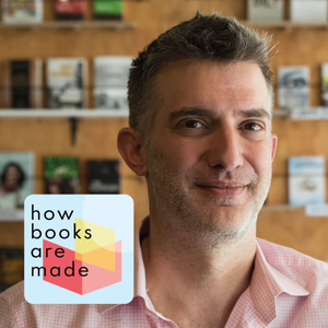
Risk, reward, and reality for indie bookstores – with Griffin Shea
There is no place more universally loved than a good bookstore. For its owner, achieving that is not as simple as it seems.
The best book shops are much more than books on shelves and a coffee bar. Behind the tranquillity, its tiny team is buzzing for twelve hours a day, liaising with publishers, distributors, authors, literacy projects, landlords, even local government, trying to build a community of people who’ll buy books and help others to buy books.
No one exemplifies this energy and broad-mindedness better than Griffin Shea, our guest in this episode. Born in Louisiana, USA, and once a journalist with AFP, Griffin now runs Bridge Books in Johannesburg, and the incredible African Book Trust, a non-profit that gives African books to libraries and schools across South Africa. He and Arthur talk about sourcing and pricing books, working across languages, connecting booksellers, the highs and lows of running a business in the inner city, and judging South Africa’s most prestigious non-fiction award.
Links from the show:
- Bridge Books
- The Golden Rhino by Griffin Shea
- Bridge Books Underground Booksellers Walking Tour
- The African Book Trust on forgood
- Griffin Shea and Ekow Duker in the Sunday Times, on chairing the judging panels at the 2022 Sunday Times Literary Award
- ‘“Star Wars” locations that actually exist’ by Griffin Shea for CNN, annotated by Mark Hamill
- Electric Book Works
Next Episode
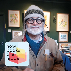
The fine-press printer’s art of not forgetting – with Graham Moss
At the heart of everything book-like is a printer, standing at a hand-powered press, turning paper into pages.
When you hold a book that’s been typeset in metal, printed by hand on fine paper, bound and sewn with board and cloth, you realise with a visceral whoosh just how much a book can be a work of art.
In this episode, Arthur speaks with Graham Moss, the founder of Incline Press in Oldham, near Manchester in England. Incline Press works with poets and artists to make limited-edition books with hand-set, metal type on vintage machines. This year, Graham was awarded the prestigious Cobden Sanderson Award from the Society of Bookbinders for his work in hand printing and publishing.
Graham’s deep knowledge and rich story-telling is a joy to learn from, and reminds us that, no matter the technology we use, book-making has always been about people, love, and dedication.
Links from the show:
- Incline Press
- Incline Press on Instagram
- Video: Graham Moss on the Arab Press
- New Borders: the working life of Elizabeth Friedländer in the University of Victoria vault library
- Elizabeth Friedländer’s ‘Elisabeth’ typeface on Bauer Types
- Video: Graham Moss on Memento Mori : Memento Vivere
- Video: Page-by-page review of Memento Mori : Memento Vivere by Ubiquitous Books
- The launch of Punch & Judy
- Liverpool Book Art exhibition, October 2024
- Electric Book Works
How Books Are Made - Fine lines in type design – with Thomas Jockin
Transcript
Hello, and welcome to How Books Are Made, a podcast about the art and science of making books. I'm Arthur Attwell.
Arthur AttwellMy dad once pointed something out to me about Beethoven. He said that, as you listen, each note is totally unexpected. And yet once you've heard it, it seems like the only note that could possibly have come next. And this is just like great typography. Even if it surpris
If you like this episode you’ll love

Episode Comments
Generate a badge
Get a badge for your website that links back to this episode
<a href="https://goodpods.com/podcasts/how-books-are-made-496668/fine-lines-in-type-design-with-thomas-jockin-74984988"> <img src="https://storage.googleapis.com/goodpods-images-bucket/badges/generic-badge-1.svg" alt="listen to fine lines in type design – with thomas jockin on goodpods" style="width: 225px" /> </a>
Copy